

As much as I am personally pleased by the results of the Scottish vote yesterday, I am more content in the knowledge that the office can now return to normal and those long-running lunchtime debates on the topic can finally be put to bed. The referendum also gave me something I am even fonder of – data!
A quick search this morning presented a table of data showing the voting statistics for each of the local authorities in Scotland. That’s great, but as is the case with most tables of data, it can be difficult to spot trends and outliers.
Fortunately, on Wednesday of last week, our partners at Qlik released the first publicly available version of their new Sense product. Sense is fantastic at providing expert visualisations of data – without needing to be a graphic designer or software developer! I thought I’d put Sense to the test and give myself an hour of time to build an application providing insights into the referendum results.
While the data could be presented in a number of standard formats, I was keen to make use of the new Map object type in Sense. To make this work, all I needed to do was search for a KML file to provide the outlines of the different Scottish authorities. A KML file is designed to plot the points around an area. They are used in all sorts of places and fortunately, in most circumstances, someone else has already done the hard work of building those files for us. Another 5 minute search of Google and I was away!
Drag and Drop
As much as I enjoy getting my hands dirty and writing complex script in QlikView, Sense works seamlessly with all flat file data sources. In this instance, all I needed to do was drag and drop my results data into Sense, confirm in the wizard that it looked ok and hit ‘Finish’. Next I did the same with my KML file (with just one minor change to make sure the Area field in the two files were called the same name to link the data). Another click of the ‘Finish’ button and that was my data all loaded and ready to go. Not a line of script written…nice!
Continuing on the drag and drop theme, I then set about dragging some map objects on to my new sheet. Setting the area as the field from the KML file and adding a measure (e.g. sum (Yes)) I could quickly see the number of Yes votes cast in each location in map form. Just a few clicks in the colour settings and I was done. Copy the object, change the measure and hey presto we have two maps. The great thing about this is that I can select within the map itself a specific area and all the other maps and objects flex immediately!
By this point I was about 30 minutes in and getting rather excited – waving colleagues over to my desk to show them what I had built and how easy it had been. Another 20 minutes were spent sorting out chart titles, adding some images, a couple of gauges, a bar chart and a few text boxes to show the high level KPI numbers and I was done. Fifty minutes!
The Results
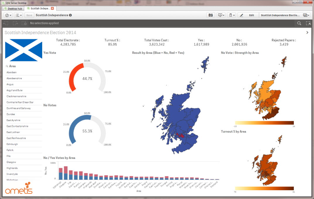
And here’s the fruits of my (not-so-laborious) labour:
What’s next for me?
Having got this far in under an hour, I’m now starting to think of more questions I’d like answered. This afternoon is likely to be spent adding in data about demographics, social welfare, unemployment and business activity. I’m sure I’ll be able to grab some more of this data, throw it into Sense and gain even more insights.
Then I’ll pop this over on to our new Sense server and probably spend my evening delving deeper on my iPad at home!
What’s next for you?
Apart from looking at the pretty picture above, we’d love to hear from any of you who would like to get a copy of the application to see just how simple it was to build. Maybe you’ve got some other data that you’d like to visualise in Sense and you want to have a chat about the possibilities. No problem – just give us a call or visit our website today.


Comments