

It’s the second release of 2018 and just 10 weeks after the Qlik Sense February 2018’s release, there are plenty of new innovations to discuss in the Qlik Sense April 2018 update.
To be precise, there are 10 improvements in the Qlik Sense April update including three completely new and exciting pieces of functionality. We’re going to take a closer look at the April 2018 release and provide a complete breakdown of the new features we’ve been blessed with in our Qlik Sense review. If you’re new to Qlik as well, hopefully this article will go a little way to help you understand why Qlik Sense is recognised as the leading business analytics software.
GeoAnalytics map visualisation
The first improvement is to the standard map component, which is shipped with Qlik Sense. Here we can see the acquired functionality from the GeoAnalytics component, formally Idevio, are transitioning over into the out-the-box map. This is something I’ve expected since it was announced they purchased Idevio and I’m glad it’s becoming a reality.
The new map is more intuitive than the GeoAnlaytics sister component but not as simple as the original map object. Having said that, creating a map and adding multiple layers all through a single object is straight-forward and comes with way more functionality than the former version. The newly updated component now includes:
- Support for multiple layers.
- Addition of circle selection based in KM
- Easily select alternative base maps; Pale and Satellite, in addition to Default and None.
- Supports auto, English and local map language.
- Units of measurement can be set to either metric or imperial.
- Set zoom levels in multiples i.e. x2, x3, x4, etc. Far easier for the average user compared to the equivalent in GeoAnalytics.
- Set pan limits – disables zooms which I’d expect.
- Set outline colours for points and areas.
- Specify separate Longitude and latitude fields – without having to use the GeoMakePoint operation.
Creating advanced map visualisations has never been easier but this is the first iteration of Qlik’s take on an advanced mapping component and it still lacks features from GeoAnalytics. For example, we are restricted to just Area, Point and background layers. The gap layers to GeoAnalytics are Line, Heatmap, GeoData, Chart and Animator.
It’s worth noting that you can’t seem to hide layers as and when you feel like it, as you can with the GeoAnalytics component with a tick of box. Instead, and on first impressions, it requires designers to put more thought when adding multiple layers.
At the time of writing this post, you control when a layer is shown in three ways, first via the ‘show in zoom levels’. Secondly, and what appears to be the preferred method promoted by Qlik, via drill-downs – providing users with a clear route through the layers and ultimately the data. And lastly, through calculation conditions. You can still, of course, have multiple layers shown at any time.
I should also mention that upon upgrading to April 2018, your maps are automatically updated to the current mapping component – I have found this can take time rendering the map for the first time. Make sure you test all applications that utilise the map object immediately after upgrading.
Editing linked visualisations
Clicking on the edit button of a linked visualisation now takes you straight into the edit panel of the master item. This is long overdue and welcomed by many app developers. As a direct result, I’d see myself using master visualisations more often. This is a great facilitator for user interface design.
Custom abbreviations
Another welcomed improvement is the ability to set custom abbreviations, the biggest gripe I had when introducing Qlik Sense to customers was that billions was shown as a G and not B. This can now be modified in the main app configuration, located in the Data load editor. At long last!
SET NumericalAbbreviation=’3:k;6:M;9:G B;12:T;15:P;18:E;21:Z;24:Y;-3:m;-6:μ;-9:n;-12:p;-15:f;-18:a;-21:z;-24:y’;
This is a nice edition with regards to technical design as numerical abbreviations plays a part in that.
Analytic connections improvement
Qlik Sense administrators now have the ability to add, remove, and reconfigure Analytic connections without the need to restart any of the services. And as if that wasn’t enough, you can also start and stop the services in any order. Meaning that, there is no longer an issue when restarting a cluster of servers and the order they had to be started in. On face value this is a small improvement, but it is going to speed up development and administration tasks considerably.
Data connections are obviously integral part of any Qlik Sense user’s day-to-day uploads, so this improvement is sure to be well received.
Allocations for new license types
Customers who have purchased Qlik Sense with support of the new Professional and Analyser license types can now configure the allocation of these in the QMC. In effect, it takes the hassle out of managing your own custom security rules, ensuring that you stay within the license terms and conditions for these users.
Qlik Sense Mobile
There are two updates for Qlik Sense Mobile. The first comes in the form of Per-app VPN mode. Qlik Sense Mobile now works in a per-app VPN mode with the appropriate VMware Workspace ONE tunnel components. This effectively means that rather than the entire device being connected to a VPN and all its traffic routed through the VPN, only Qlik Sense Mobile apps are routed through the VPN, minimalising the load on the VPN server.
The second improvement is the ability for Qlik Sense Mobile to interact with third-party mobile applications through a custom generated URL (deep link). This provides a seamless transition for users from Qlik Sense Mobile to third-party applications.
Authentication port
It is no longer necessary to use port 4244 as the authentication port. This means that if you are using SSL to protect your environment, you can use port 443 for the Qlik Sense Proxy service.
Qlik Sense hub keyboard shortcuts
To improve accessibility, Qlik Sense hub now supports keyboard navigation and shortcuts.
Enable anonymous users to export data
Anonymous users can print and export data.
I say this every time but it’s genuinely great to see Qlik continually improving the product, at an impressive pace as well. Improvements are not just new functionality but constant refinement of the current functionality to make the product more intuitive, capable and effective.
Let’s now turn our thoughts to extended functionality in April 2018’s release. We have three completely new pieces of functionality – two are common requests and one is simply awesome!
Publish an app from the hub
You can now freely publish an app to any stream in which you have permission to do so. The application is maintained as a local copy in the owner stream. This is represented by the stream icon.
![]()
And it’s now simple to move an app from one stream to another, without having to duplicate and republish.
It’s important to note some change to the behaviour of publishing an app, that I’ve noticed. The first change is when publishing an app for the first time the app is still moved from the owner’s work stream to the published stream, but instead of the app no longer being present in the owner’s work stream, a reference thumbnail remains. You cannot modify this app but you can move it to another stream or duplicate it.
This is a nice feature a lot of developers have been waiting for. However, there is still something missing for me – the ability to duplicate community sheets at the point of duplicating an app or moving community sheets to the base sheets. In addition to that, you can’t overwrite a published app from the hub or delete an app, which feels like half a job but I will pose the questions to someone at Qonnections 2018 to find out the reasoning behind it.
A limitation has been identified by Qlik, in that apps containing attached data files with sections access settings applied are at risk of the data being exposed to restricted users when the application is published and then duplicated. The advice by Qlik is to remove the attached files prior to publishing the application. I don’t see this affecting too many users and there are obvious workarounds… i.e. don’t use attached files for restricted data, use folder connections instead.
It’s also worth noting that the user needs publish permissions to the stream in order to publish. This may sound obvious, however if you have given the user published permissions to allow them to publish sheets in the past and you haven’t filtered the resource to only sheets, then it may open a can of worms. Be careful! In the past this didn’t matter as you could only publish from the QMC, so providing they were restricted to the hub it wasn’t a concern…now it is!
Change grid size
You can now change the grid size from the standard 24 blocks (width) by 12 blocks (height), which is now known as Small, to Medium (30 x 15) or Large (36 x 18). You can only do this on blank sheets however, rather annoying if you want to apply this to previously created sheets.
Assistance
Qlik have now released the cognitive engine in the form of assisted data visualisations. Qlik are taking the thought out of building visualisations, with chart suggestions created using the cognitive engine. Previously, when building a visualisation, you started with the chart type, then you’d specify the dimensions/measures. Now you simply drag and drop fields onto a sheet and Qlik’s cognitive engine will do the rest for you. My first thoughts are ‘Amazing!’, I did three simple tests to see what it came up with:
It’s worth noting that any field, master dimension or master measure you drag onto the sheet is added as a chart with Assistance enabled.
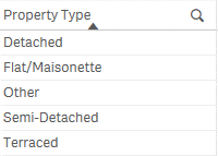
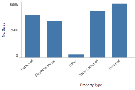
Test one
I want to visualise the ‘No. Sales’ by ‘Property Type’. So, I placed the products field onto my sheet, Qlik added the field in the form of a table:
Next, I dragged a master measure (No. Sales) onto the table. And Qlik turned the visualisation into a bar chart… excellent!
Now, all that is required is to do the last few changes to the appearance. Changing the sort and orientation. To do this you must disable Assistance. Be warned any changes you make with Assistance disabled will be reverted back if you re-enable it at a later point. So, in my opinion you should not re-enable Assistance once you’ve disabled it and made changes.
Test one conclusion
It’s very intuitive. It identified the correct chart type for the data and it’s what I would have chosen myself. However, it would be nice for future iterations to know the most appropriate sorting order and not default to alphabetical. In this example, I wanted to sort by the measure. Also, if there is no ordinal sorting order, I believe it should default to a horizontal bar chart, and not vertical.
Test two
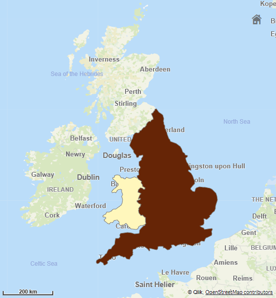
I now want to plot ‘Avg Sales Price’ by ‘Country’ on a map. It’s worth noting at this point, Qlik has automatically detected and provided a look-up by country field, meaning it’s now geocoded and in theory should have a shape file associated to it. After dragging the ‘Country’ field onto the sheet, I’m presented with a map… a good start.
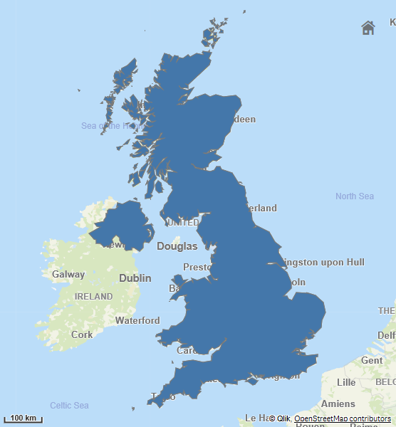
Next, I dragged the ‘Avg Sales Price’ onto the map and something just isn’t quite right. I know the data only contains values for Wales and England, but the polygon is of Great Britain.
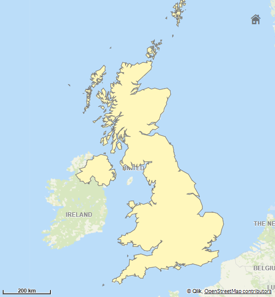
After disabling Assistance, I noticed the location field it had chosen wasn’t my ‘Country’ field but a GeoInfo field it creates automatically during the load, changing this to be the ‘Country’ field made it work:
Test two conclusion
It does what it says on the tin – it suggested the correct chart but required human input in order to display the data correctly. I’d still say it was quicker than starting from scratch, with the chart first.
Test three
I now want to see how it handles numerical fields. I have a field called ‘Sales Price’, this is a field and not a master item. So, let’s see how Qlik handles it…
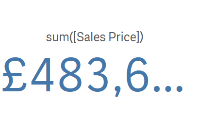
It turns out pretty well! It immediately added it as a KPI and wrapped it with the default aggregation, SUM.
Test three conclusion
Effortless KPI creation, without defining it as a measure. In my opinion I’d like an option to change the aggregation without having to type/overwrite the default or if I add the same numerical field again I think it should use a different aggregation, but that’s me nit-picking on an otherwise fantastic new feature.
That’s three tests and three positive outcomes. Data visualisation has become even more intuitive and I see this further enabling self-service going-forward. Due to the change in workflow when working with the Assistance feature, it’s worth mentioning that the assets panel has been sorted differently in non-published apps. As you no longer need to specify a chart type to begin with, Qlik have moved the Fields and Master items sections to the top of the assets panel.
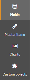
For published apps though, it maintains the original sort order; Charts, Custom objects, Master Items, with the Fields lists still hidden. I’m in two minds over this particular change to the assets panel, on one hand it absolutely makes sense to alter the sort of the options, as it suits the new workflow. However, while it maintains continuity for end-users it may cause frustration for developers due to the inconsistency.
Some other notes worth covering are, if you enable assistance after creating a visualisation, the assistance will apply changes immediately. These can be restored if you use the undo changes button, but unfortunately this is not an option after navigating away from the sheet. Qlik have warned that all NPrinting reports that include any charts with Assistance mode enabled will fail, you should therefore make sure you disable assistance on all necessary charts. We would recommend educating users to disable assistance mode, as a default, once they have finished building a visualisation. And lastly, if you want to add a filter pane by dragging a field onto the sheet you need to hold down the Shift key before dragging the field onto the sheet. This will add the field without assistance.
Qlik Sense April 2018 Update – The Conclusion
The introduction of the cognitive engine with suggested chart types has streamlined the process beautifully. This is a positive step forward in the front-end of Qlik Sense. In the last release (Feb 2018), we saw a similar story with Recommended Associations – streamlining the data load process within the Data manager.
My three favourite features improved or added this release are:
- The out-the-box map component, with its more-integrated look and feel, compared to GeoAnalytics.
- The ability to publish from the hub and not require multiple browser tabs open or needing to provide users with access to the QMC at all.
- And lastly, Qlik’s Assistance; speeding up the creation of data visualisations and allowing more, non-technical, users to self-serve with ease.
The next look forward for myself is at Qonnections in Florida and I’ll be sure to write a post about my findings afterwards. Please keep a look-out.
By Christopher Lofthouse
Topic: Data analytics


Comments