

Qlik Luminary Chris Lofthouse explains the benefits of claims triangles in Qlik with a quick guide to help utilise this powerful tool.
Over the years, I’ve been required several times to create claims triangles in Qlik and it’s obvious why! Once built, they are automated (time-saving is a huge influencer) but it also provides richer analysis when combined with the Qlik Associative engine. It empowers users to freely explore the data, filtering the data by location, business unit, channel, underwriter, etc. So here is a quick overview into the subject…
What are claims triangles in Qlik?
Claims triangles in Qlik, also commonly known as loss triangles, are typically used by insurance companies as a way of reporting claims data and as an actuarial loss-reserving technique; to understand how much money the insurer should hold in order to meet all outstanding and future claims arising from active and past written policies.
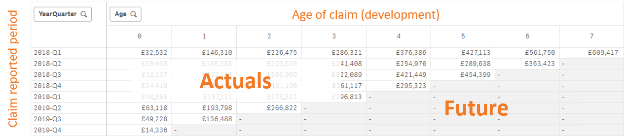
In my experience, a claim typically relates to particular period (month, quarter, year, etc.), based on the claim received date. Payments related to a particular claim are potentially made over several years as the claim matures, commonly referred to as the ‘Age’. In the visual below, we have the claim period down the left-hand side and the Age (in quarters) across the top.
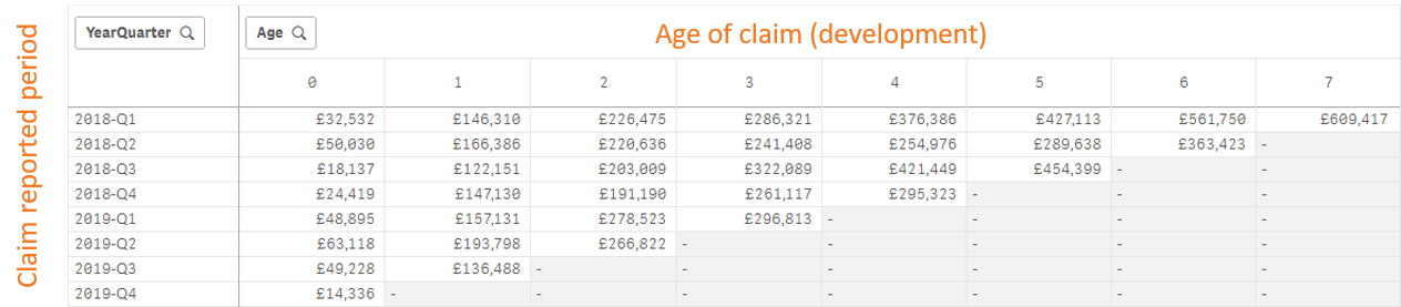
Looking at the loss triangle above, the accumulative values on each row relate to claims made in that quarter, for example all values on the first row relate to claims made in ‘2018-Q1’. The columns represent the accumulative amount paid by the insurer in respect of the claim date. Therefore, column ‘0’ represents the same period, e.g quarter, that the claim was made in.
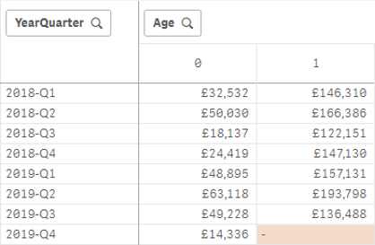
For example, for intersected cell of row ‘2018-Q1’ and column ‘0’:
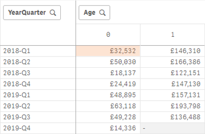
The highlighted cell represents payments made in ‘2018-Q1’ for claims made in the same period.
For intersected cell of row ‘2018-Q2’ and column ‘0’:
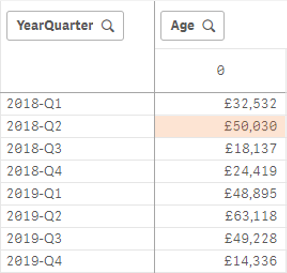
The highlighted cell represents payments made in ‘2018-Q2’ for claims made in the same period.
On the other hand, for the intersected cell of row ‘2018-Q1’ and column ‘1’:
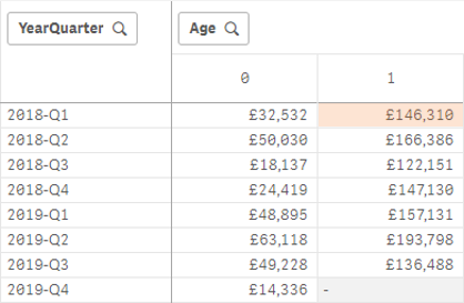
The highlighted cell represents payments made in ‘2018-Q2’ in relation to claims made in ‘2018-Q1’. Following this logic we end up with an inevitable triangle, in fact we end up with two. The filled-in triangle represents claims, and associated payments made to date (actuals), and the greyed-out cells represent future periods.
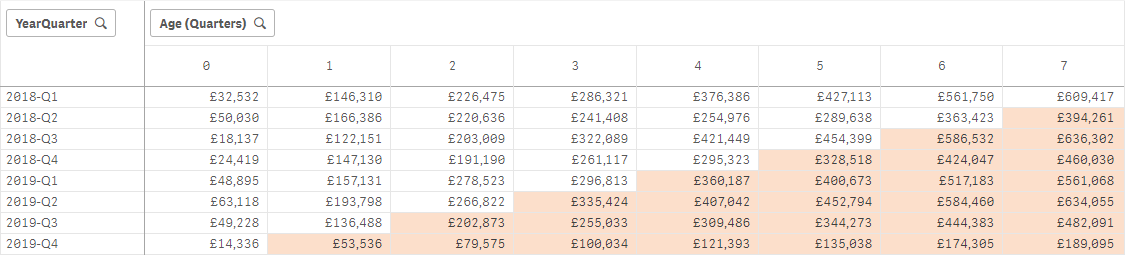
Therefore, for the highlighted cell, below, represents payments that will be made in ‘2020-Q1’ related to claims reported in ‘2019-Q4’, but as I am writing this blog at the beginning of 2020 that is still a future period (we are only reporting on full periods in this example).
How to create a claims triangle in Qlik Sense?
This isn’t a straight-forward answer because it depends on the data structure as it comes into Qlik. In some cases, I’ve not had to do any transformations but simply visualise the data. In other cases, I’ve had to perform some transformations, such as calculating the age based on the payment date in relation to the claim date. The main things you’ll need here is the claim and payment date on the same row. Either way, you should be conscious to model the data so it provides full flexibility to slice and dice the data over the relevant fields and to the necessary granularity in order to offer the most value. Being able to associate other data, including external data, to your claims can be highly insightful over and above the obvious.
What additional benefits does Qlik Sense offer to claims data?
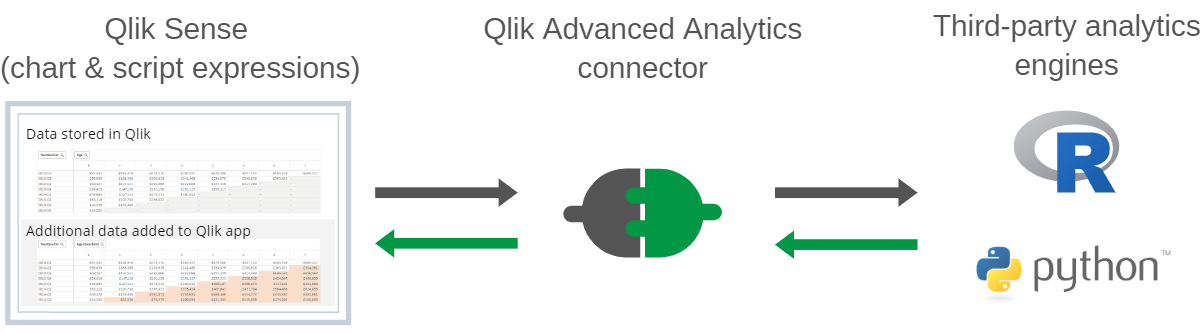
Put simply, it can fill out that second triangle; the future periods. By leveraging Qlik Sense’s Advanced Analytics connector, you can connect your R or Python engines to Qlik in order to execute your data over statistical models such as the Chainladder package, for projecting ultimate loss amounts:
The benefit of Qlik’s Advanced Analytics connector is that you can run those statistical models during the load process of the application and/or live as users are making selections. Ultimately, this kind of insight can help drive your organisations processes/underwriting guidelines.
I’ll take this opportunity to thank Simon Kirby for sharing his examples, created by Steven Pressland, which enabled me to get a better understanding of how to structure R expressions using the R.ScriptEval() function in Qlik.
How does the advanced analytics connector work and what’s involved?
Qlik Sense on Windows versions have the ability to create advanced analytics connectors which act as a mule for exchanging data and commands between Qlik and third-party analytic engines such as R and Python. This is setup in Qlik’s management console and is relatively simple. The prerequisites for this is having the analytics engine of choice installed for Qlik to work with, in the examples above I have used R, which we have installed on our pre-sales server for demonstrations but I should note there are compelling reasons to use either R or Pyhton, and also alternatives. Here is a recent comparison I think summarises the strengths and weaknesses quite nicely.
I have included some specific install materials for R that may be of interest, below:
With the analytics engine in place and the connector setup, you can begin your advanced analytics adventure in Qlik. This will enable you to send Qlik data through the advanced analytics connector with commands to execute against the analytics engine. This can be achieved using script expressions, during the load process, with the results being added to the Qlik Sense app, or using chart expressions with the results complimenting the data model in the specific visualisation that the expression was made from.
For more information, get in touch to see how we can automate your reporting of claims data and provide further insight with Qlik Sense.
Topic: Data analytics


Comments