

For those of you who follow Qlik closely, you’ll have noticed that the Qlik Sense June 2017 (or 17.06) Technical Preview has been released. This is the first in the new release naming convention and cadence – now five times per year.
Having seen it demonstrated at Qonnections, we were excited to get our hands on it. So as soon as it came out I installed the Desktop version to start familiarising ourselves with the new features. The data I decided to use was the electricity generated by the solar panels on my home roof which is logged at 15-minute increments.
The first thing you’ll see when loading data in is a range of new options in the Data Manager…
Measure Suggestions & Tools
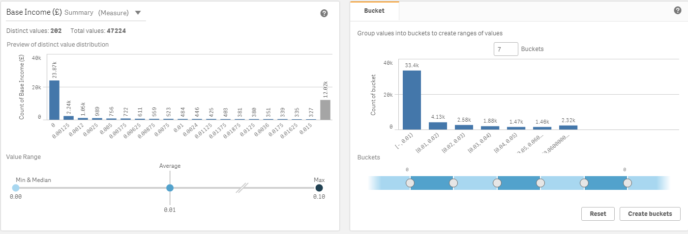
Here you can see that Qlik Sense has recommended the selected field should be a measure and shown a histogram of the frequency of values in that field – including the min, median, average and max statistics. Qlik Sense has also suggested that, since this has numerical values they could be put into buckets. All of this can be customised, but Qlik Sense makes some good guesses.
Dimension Suggestions & Tools
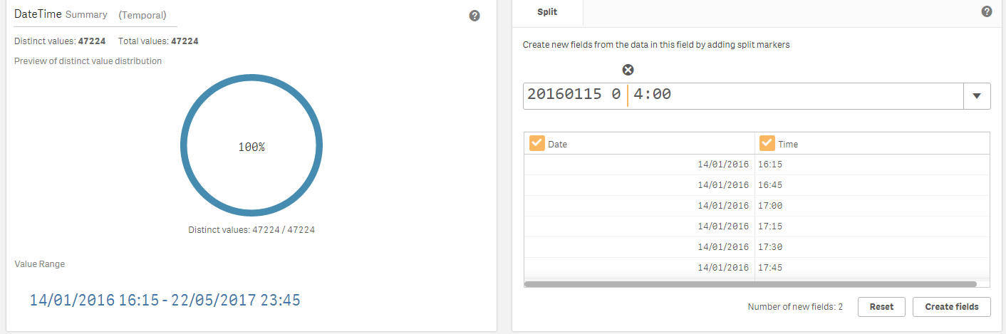
In this screenshot, you can see what analysis – range and uniqueness – and options – the split tool – Qlik Sense presents when you select a dimension field. The split tool allows you to break a dimension field down, which is common for things like date/time fields, phone numbers or composite keys in source data.
(Yes, I know the split location looks wrong – that’s what I had to do to make the preview look right – I’ve logged a bug about that)
If you select a field that has fewer distinct values, you get a different set of tools:
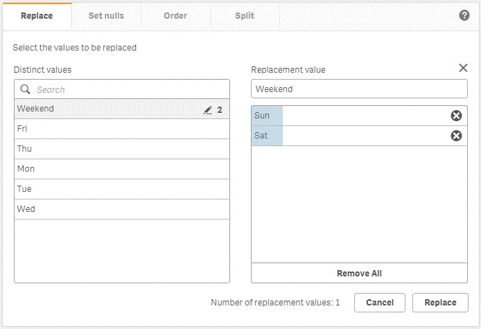
Here you can see that I have the choice to replace values in the DayofWeek field – perhaps I want to group my Sat & Sun into one value called “Weekend” – I can do that here.
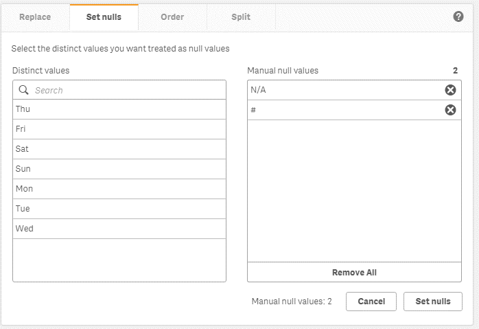
I can null values if I want to ignore those in a chart for some reason – here I’ve done that with some errors from the source data.
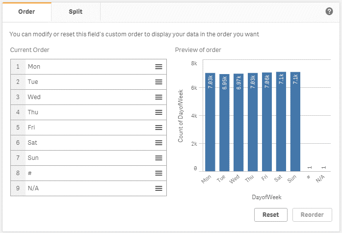
And here’s how you set custom sort orders – drag & drop interface for setting the default sort order.
Please note that not every combination of these tools works with every other one – for instance you can do Order & Split together but not Nullify/Replace with Order.
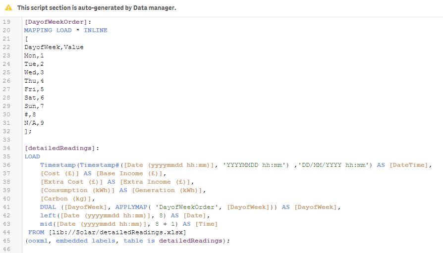
What’s going on behind the scenes?
With all this in the data manager, what’s going on in the Data Load Editor? The script that Data Manager generates is all there and viewable – locked by default.
New chart types
Once you’ve got your data imported using this new interface, you’ll see some three new charts you can use:
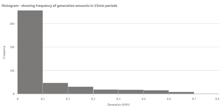
Histogram – you just select a numerical field and it shows you the frequency distribution of values. You can customise the buckets (number or size of them), but that’s about it – so there will be scenarios where you want to use the buckets in the data load and a bar chart to achieve histogram-like charts with more flexibility.
Box plot – this is something that has been much-requested – especially by the statisticians amongst us. Whilst I’m not a statistician, I can see the value here. You select a couple of dimensions and a measure and it will do the box plot for you. You can choose from Standard (Tukey), Percentile-based or Standard deviation as presets or you can customise your own:
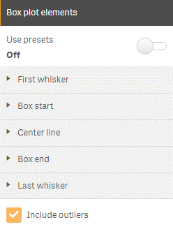
In this case I chose to use the percentiles preset, setting the whisker lines at the 1st and 99th percentiles with the box ends at the 1st and 3rd quartiles and the line being the median. The dots are the “outliers” – there tends to be at least one each month as I only have 14 months of data in there so there are only up to 62 days for analysis, so they’re effectively the minimum and maximums within the months.
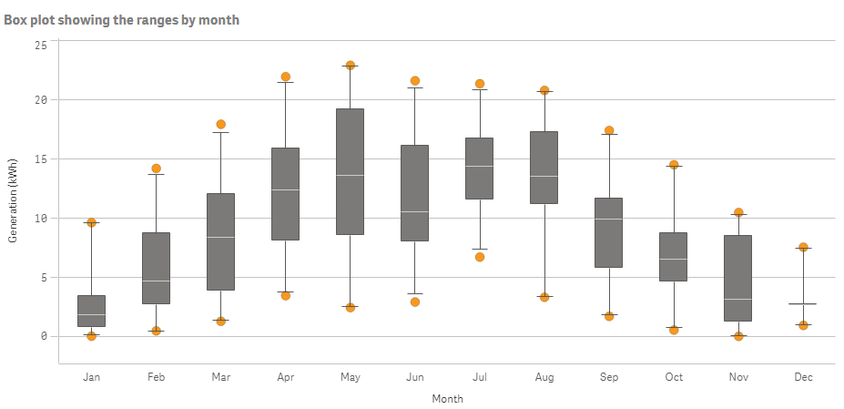
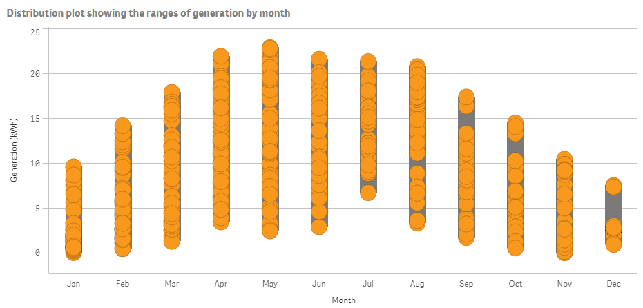
Distribution Plot – a simpler, less statistical, chart that, similarly to the box plot takes a dimension or two and a measure. Here we can see each day’s generation plotted in its month, visualising the minimum, maximum and range of each month.
Consistent Colours for Dimensions
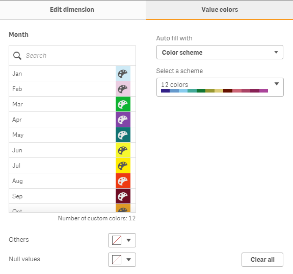
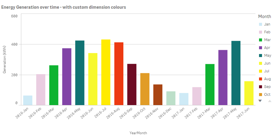
Enhancing the “Colour by dimension” functionality, here we can see that I’ve set custom colours for the months, inspired by someone with synaesthesia who sees the months as these colours. For example, this could be useful in your sales performance app – setting a consistent colour for each salesperson to be used across the app.
Not yet reviewed
There are a few things we’ve not covered here because we’ve not had enough time to test them just yet:
• iOS app including offline support – we’ve got this installed and are starting to test it now
• Advanced Analytics, including R integration. Qlik have just published the details of setting this up – we’ve got it running but want to work with it a little more before sharing our thoughts
• Platform component updates – in this blog we’re been looking at the end-user experience, but the removal of the requirement for a single “central node” certainly looks interesting and a good step forward for resilience. The Enterprise Mobility compatibility (MobileIron, AirWatch & Blackberry) will certainly appeal to some of our more security-and-mobility focussed customers too.
Summary
This is a really exciting release of Qlik Sense – great new features across the board serving the end users, power users, enterprises, IT administrators and more. We can’t wait to get our hands on the other features we’ve not been able to test yet and the final release when it comes out.
Next steps
Most people should now wait until the final release to get these features and then look to upgrade at that point. However, if you’re a Qlik customer and keen to get hands on, you can also join the Technical Preview that will run until 26 June. To do this, just visit the community page and register. Health warning: this isn’t recommended for anything approaching a Production environment and it may stop working altogether after the 26 June deadline and/or you may have to uninstall it completely before being able to upgrade to the final release when that comes out.
Some useful pages in that community include:
• What’s New – a good summary of the new features, although lacking in a little detail so some can be hard to find! Also note that it’s listing some items that aren’t actually new in this release of Qlik Sense – like new Web Connectors and Qlik Sense Cloud features.
• Advanced Analytics video – first half of this shows some of the things the R integration will be able to do
Alex Walker
Service Delivery Manager


Comments