

Chris Lofthose shares his expertise with Qlik titles to represent visualisations and help you build compelling reports and dashboards.
I find it all too common that titles in visualisations are wrongly used in reports and dashboards. You may wonder why I’m even bothered by something that is often overlooked or you may even consider unimportant. However, I believe the title of a visualisation can have a strong influence over an end-user, ultimately I see it as one of the driving factors deciding whether the user pays attention to that visual or not.
So why are object titles turned off by default in Qlik?
Qlik titles – My assumption is if you don’t have anything useful to say, don’t say anything!
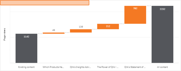
What I mean by that is don’t state the obvious, users can find it patronising. It makes me cringe when I look back at when I was at school and the teacher taught us to add a ‘state the obvious’ title to a chart, such as ‘Speed over time’. In the context of the chart above I could write ‘Page views by content’, but I’m not going to do that. The reason I won’t be adding a title like this, is because axis labels/tooltips contain the same words! Why repeat what’s already present? It just adds unnecessary noise.
How can we compliment a visualisation with a useful title?
It’s going to sound obvious but a useful title consists of being less obvious and more descriptive. For example, ‘Showing the breakdown of page views by new (orange) and existing (grey) content’. This is good, however I find a better approach is to write the title as a question, such as:
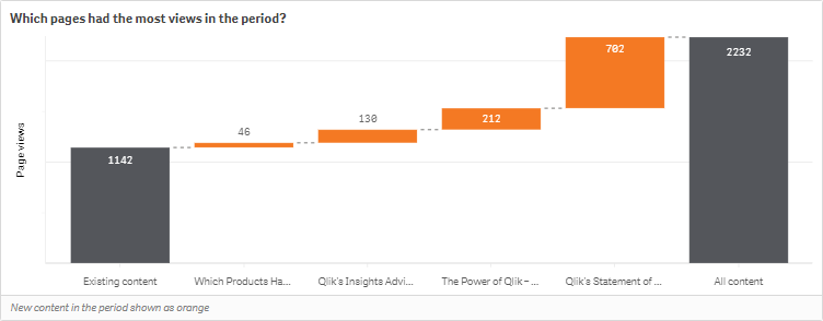
When someone is given a question, it kick-starts their analysis process, as I often find once one question has been answered, more tend to follow. To ensure no detail is lost, I have also made use of the footnote to highlight what the labels do not. Again, this is only necessary if it’s not obvious.
We can continue to evolve this further…
What if, rather than giving users a question to answer, we give them some insight into the data? For example, the intent of the chart above is to highlight traffic to blog posts, specifically focusing on the makeup of the traffic visiting new and existing blog content. Take a look at the following:

In the snapshot above, we compliment the visualisation with some insight that is not offered by the object itself. For less data literate users this may give them insight they may have otherwise struggled to find, for others it may simply speed up the analysis process and to someone that is inquisitive about data, such as myself, I’m left thinking which blogs, what type of posts were they, when do most views happen… the list goes on.
In short, the next time you add a title to a visualisation, don’t make it obvious, try and make it insightful, otherwise leave the title turned off!
By Chris Lofthouse
Follow @clofthouse89


Comments