

Visual Data Preparation
With Qlik Sense 3.0, self-service data exploration goes to the next level with visual data preparation. Previously, to link tables of data together took a bit of know-how. Now the tables are shown in their own “bubble”, meaning that you can drag tables that you know should be linked together and Qlik Sense will associate them based on the data.
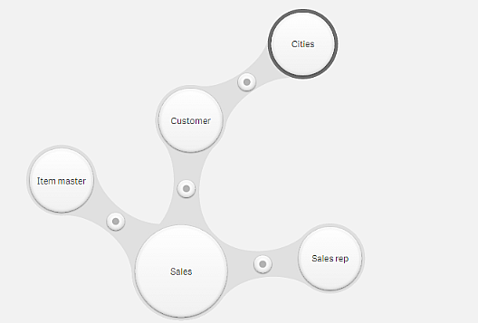
Figure 1 Table “bubbles” linked together in the new Visual Data Preparation window
Now you can leave the complicated job of modelling your data to Qlik Sense and concentrate on what is important, analysing your data.
Branding
Add some pizazz to your Qlik Sense apps by branding them. Add your company logo and colours to your Qlik Sense apps making your corporate applications look more professional.
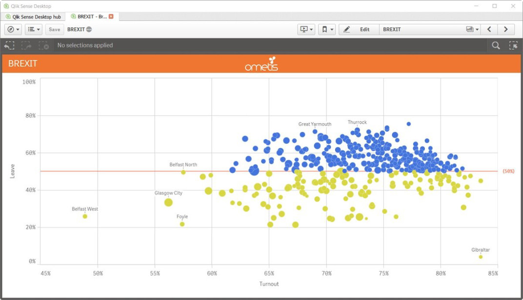
Figure 2 Apply branding to your Qlik Sense Apps
Visual Search
Search has become visual in Qlik Sense 3.0. With the addition of charts to the standard search tool, you can now save time searching through sheets and sheets to find the one you want. You can even search for chart types and Qlik Sense will return the most relevant results!
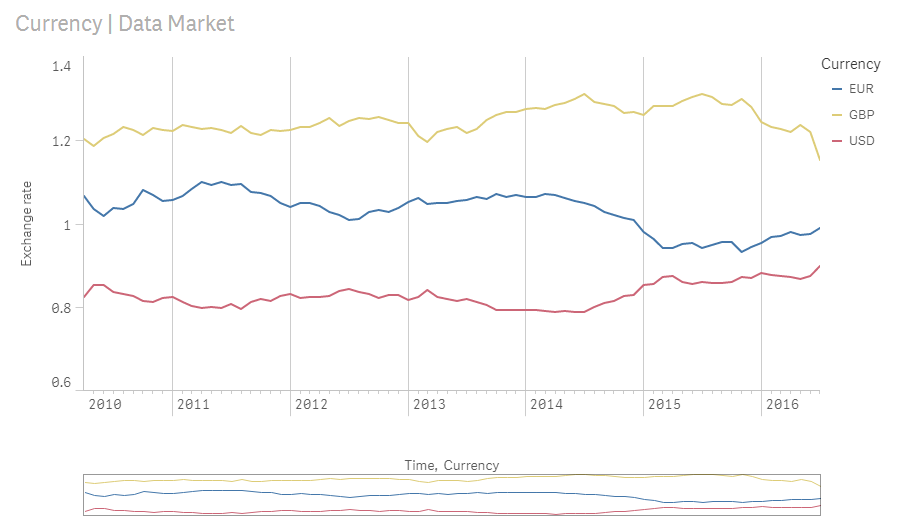
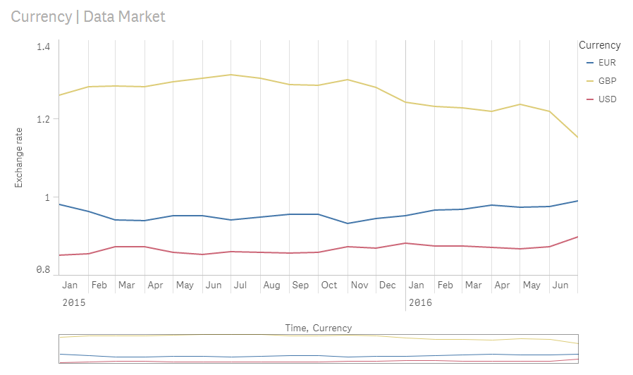
Time Aware Charts
Charts in Qlik Sense have always helped the user build something powerful in just a few clicks, but Time-aware charts in Qlik Sense 3.0 take this a step further. You no longer need to build your own calendar tables and pre-select the most appropriate granularity of date to use in your chart.
With Time-aware charts you simply add the original Date field to the chart and Qlik Sense will automatically work out the best way to display it. It could be days, weeks, months or years – Qlik Sense will automatically scale the chart for you.
In addition to this, it will also understand if you have missing data points where you may want to show a continuous scale and auto-fill the gaps. Line charts are available in this release, but you can expect to see other chart types with this functionality in future versions.
No selections:
2015 & 2016 selected
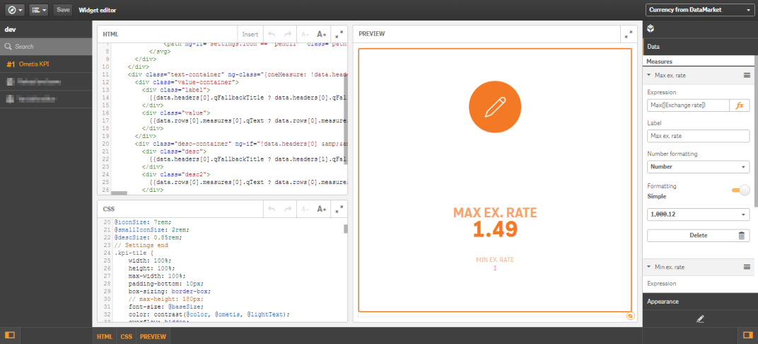
Widgets
This new feature gives us, the developers, the freedom to create what the customer wants but doesn’t yet exist in Qlik Sense. Widgets can adapt to the shape and size and the customisation possibilities are endless. In this example we’ve made a KPI where the icon can relocate itself or disappear if necessary depending on the size and shape of the widget. The icon and the colours can be changed and the second measure is optional, and this is only the beginning!
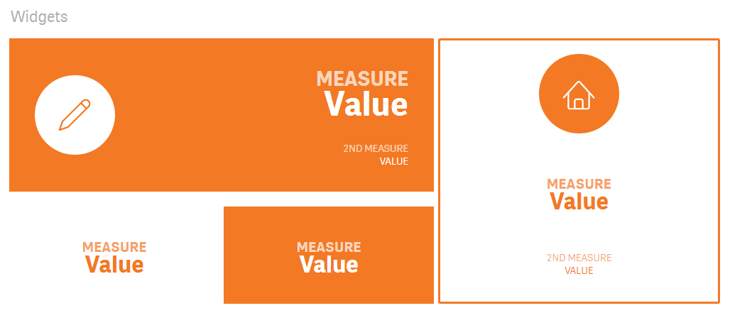
The widget editor allows us to use HTML, CSS and Angular.js to create and edit widgets. It’s a comfortable place for a developer and gives us all the tools we need to preview our widgets as well as to connect them to a published app to test it with real values.
This is just tip of the Widget iceberg – the possibilities are endless!
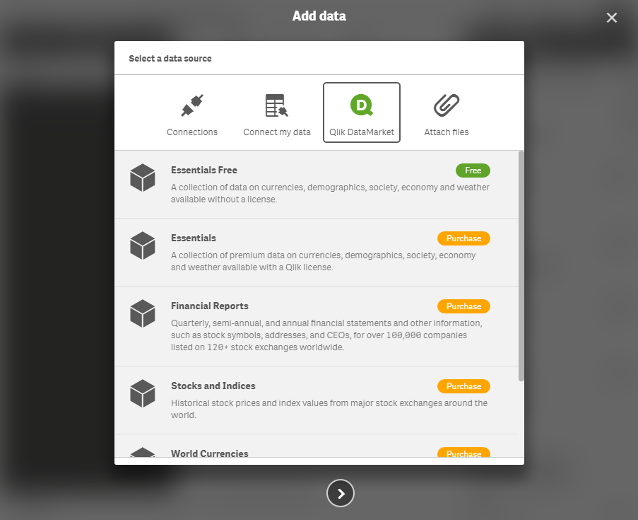
DataMarket
Qlik DataMarket is a revolutionary new Data-As-A-Service offering from Qlik. It allows direct access to a range of standardised information that can help supplement your analytics. With Qlik Sense 3.0, Qlik have included access to four new premium data packages:
Historical stock prices from major stock exchanges
Financial data from companies worldwide
Population indicators for India’s states and districts
Population of Canada by provinces or territories
While we expect Qlik to continue to add in population and demographic data of new countries fairly regularly, it’s great to see some additional company and financial markets data being released.
We can see some great use-cases for this. Imagine supplementing your ERP or CRM data with the latest stats about your Customers or Vendors. For some of our Financial Services customers, having the ability to get single-source access to financial markets data will make a big difference in how responsive they can be when making data-driven decisions based on Qlik dashboards.
We’re looking forward to seeing what other new packages are made available in the coming months.


Comments