

What to consider when testing a Qlik Sense app
Since I started developing applications in Qlik Sense and QlikView, it has sometimes been taken for granted that the tester knows what to test in an application. It’s not unusual to assume the business user, or stakeholder, who specified the requirements, knows the best way to test an app. However, for less familiar Qlik users, it may not be that obvious where to start or what to consider when testing. This blog post lists some of the main considerations and what to tick off during the user acceptance testing of a Qlik Sense app.
Layout
Application Overview
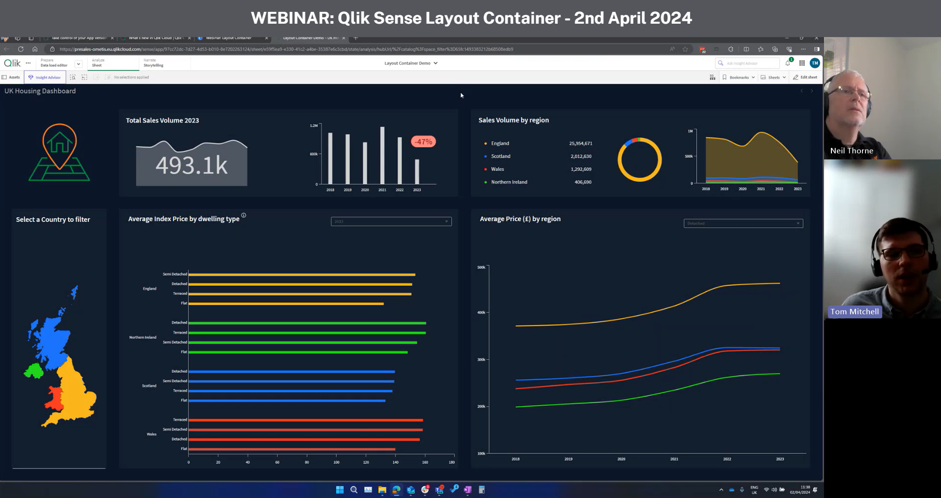
When you open a Qlik Sense app, the first you will see is the application overview, which presents the sheets residing in the app. The first thing you need to consider is whether the order of the sheets is lined up in a logical way. Are they ordered in the way you would normally read the report or use it when conducting your analysis? Secondly, are the sheet titles and thumbnails telling you what the sheets contain? Is it obvious what is presented in each sheet, even as a new user of the app? Lastly, consider whether all the sheets are needed and actually being used – can some of the sheets be made redundant or merged with one another?
The DAR methodology is a standard sheet layout foundation which is widely used in business reporting. DAR stands for Dashboard, Analysis and Reporting, and is a top-down approach which starts with a high-level overview, or a dashboard, and then continues with a more explorative analysis and finally ends with a detailed report presenting the lowest level of the data. The idea is based on research on how humans interact with and perceive information, and the aim is for the user to gather information through perception and cognition which ultimately leads to action. Even though the DAR layout is considered best practice, you may question if all of the parts are really needed in your specific use case.
Sheet Layout
When you are comfortable with the application overview, you can delve into the individual sheets. Each sheet in a Qlik Sense app can roughly be compared to a tab in an Excel file or a page in a traditional report document. The first thing to consider is whether you can get a quick overview of the navigation and make sense of the information presented. Is it easy to navigate and understand the sheet layout? Can you quickly find what you are looking for? Does the sheet quickly answer some of the high-level questions, so you can spend more time exploring the follow-up questions? Is it obvious where and how to filter the report, and also get back to the starting position?
Another thing to consider is the number of visualisation objects presented. Are you being overwhelmed by an information overload? The use of tabbed container objects can serve as a good solution when you quickly want to navigate between several larger visualisations without having to leave the sheet.
Visualisations
One of the main considerations when testing the user interface of a Qlik Sense app is how the visualisations are being used. Does a chart answer the questions you ask on a regular basis? Also, something that may be nice to know is not necessarily something you need to know. Each visualisation has a specific purpose and different charts may be used depending on whether you’re looking for comparisons, relationships, compositions or distributions of your data. Qlik offers some useful guides on when to use what chart type on their help page here:
Using colours in visualisations is a powerful way of directing attention and facilitating the analysis for the end user. The more groupings or dimension values that dwell in your data, the more difficult it may be to separate them. Consider whether colours by dimensions or colours by measures are being used and which helps you distinguish what is being presented. Besides using colours, you may also want to make use of trend indicators and reference lines to make the measures more comparable and meaningful. A number in a KPI box may mean something more if it’s compared to a benchmark.
Lastly, when testing the visualisations, consider how they respond to selections in the filters. Are they time-aware? In other words, are they designed to take into account date selections at different points in time? If the visualisations are more fixed, or designed to disregard certain selections, is it obvious for the user that the visualisation is of a more static nature? This can be made obvious by stating it in the chart title and the chart description.
Data Validation and Reconciliation
This point is perhaps the most obvious one and what you are typically prioritising as the end user, regardless of experience with Qlik. Data validation refers to the correctness, meaningfulness and security of the data input, whereas data reconciliation refers to the accuracy of the data compared to the original data source.
The validation of the data input is most likely agreed upon in an earlier stage of the application development, but it’s worth validating that the right data is presented in the right place. Also, consider whether all the data fields that are loaded and presented in the application are actually being used by someone, in order to eliminate potential redundancy.
Data reconciliation can be made by the Qlik developer to some extent, but to assure the accuracy of the data, the business analyst or whoever works with the data source on a daily basis will obviously be more familiar with it and should be involved in the testing. Reconciling totals and also some row-level samples is a good way to start, but consider using test scenarios to ensure that it looks correct on all levels.
Access
Data security is one of the most important aspects in the end. It basically means which user gets access to what data. You can roughly divide the data access into stream access and section access.
Stream access refers to who gets access to the stream where the application resides. Consider whether the other apps within the same stream should be accessed by the same users and/or user groups.
Section access refers to the row and column level security within the application. In other words, which user gets access to what data in the app. A more detailed description on how to implement Section Access can be found in this earlier blog post.
Terminology
When you have tested the most essential aspects of the app, such as the accuracy of the data, the application layout and the security, you can move on to the smaller details. The terminology of the app refers to the naming convention of the dimensions and measures. Qlik Sense allows you to use whatever field name you want in the user interface by creating master items of the input fields. In other words, you don’t necessarily need to use the original data source field names. Also consider whether the dimensions, measures and chart titles are explanatory. Using questions, which the chart is answering, is one way of naming the chart titles, for example. If there is a lot of terminology used in the app, adding a glossary sheet in the end as a reference may be a good idea.
Future considerations for Qlik Sense app testing
In this blog post we have listed some of the main considerations when testing a Qlik Sense app. Besides the points listed above, there are some long-term considerations that can be good to have in mind when building and testing applications in general. For example, is the application fit for growth? How well will the application respond to an increase in data volume? What if the number of reports and data sources increases? How well will the application respond to an increase of users? If the application grows too large, would it be an easy task to split it up into several apps? To consider the scalability of the app does not always mean upscaling because of an increase in data, but can also mean downscaling and removing content that is no longer relevant.
By Mats Severin
Topic: Data analytics

Comments