

In my recent blogs I have spoken about the exponential changes happening with Qlik Sense, so I wanted to look at the impact it’s had.
Let’s have a quick recap, in the Qlik Sense February 2018 release, Qlik’s Cognitive Engine was quietly introduced in the form of Recommended Associations. Fast forward to June 2018 and, as announced by Qlik’s director of research (Elif Tutuk), the Beast has been unleashed with Chart Assistance and Insights Advisor.
For more information about the latest features read my Qlik Sense June 2018 release blog.
The Qlik Cognitive engine is described by Qlik as doing the heavy lifting, on the user’s behalf, during the full analytics workflow. It forms part of their Augmented Intelligence strategy; assisting humans, providing an equal data-playing field for the full spectrum of data literate users.
So how does this impact a Qlik Sense user?
Firstly, let me start by telling you how it’s impacted me and my colleagues. In May 2018, myself and Ometis’ Sales Manager, Andy Patrick, were given access to a technical preview of June 2018 for the Qlik Sense Tour. While on-site with a client performing a PoC, Andy thought it would be a good test to try the Insight Advisor on real-world data. It’s important to note that I had already cleansed and modelled the data at this point and, while Andy was using June’s technical preview, I was using Qlik Sense April 2018. Just five minutes into the build Andy, to my disbelief, was calling the prospect over.
With the Insight Advisor, Andy was able to produce the same visualisations I had but without building a single chart from scratch. In just a few clicks, Andy had bar charts, line charts, scatterplots and maps, utilising a multitude of metrics from basic aggregations through to pareto and geo-spatial analysis. Both the prospect and myself was stunned!
Secondly, from attending Qlik’s Partner Enablement Day recently, it was great to hear once more about their drive to reduce clicks and time to insights. So, you won’t be surprised that I wanted to collect and analyse some data on the subject.
So, how has Qlik Sense progressed in 2018?
I decided to use the Qlik Sense Tour workshop materials that I delivered in June as the test case, with the goal to reproduce the following dashboard, as best I could, in each of the last 4 releases of Qlik Sense (from November 2017 to June 2018).
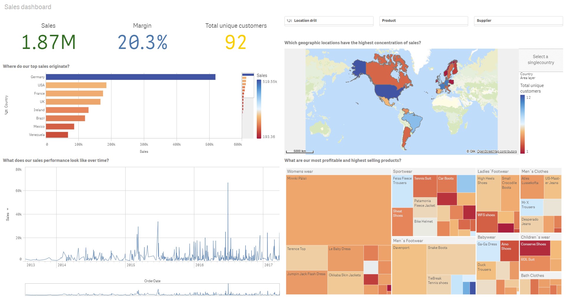
Focusing on time to insights, we can see in the visualisation below that the total time taken to perform the tests, data prep (loading and associating data) and data visualisation, has decreased by 2.25 minutes from November 2017 to June 2018. Put differently, that’s an increase in productivity of over 20%.
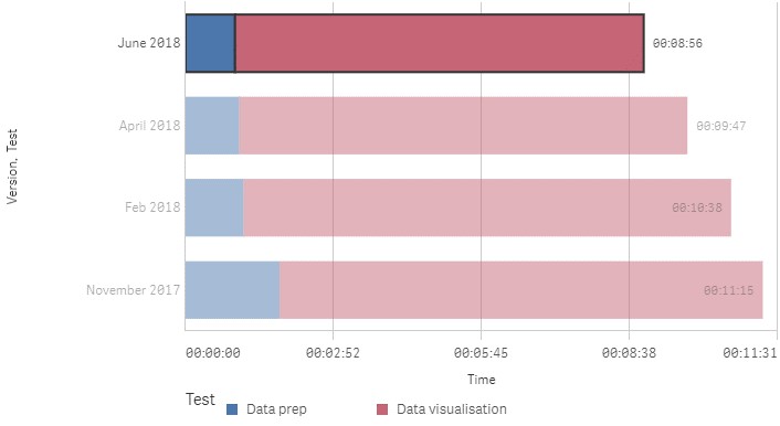
The majority of the time saved for Data prep was between November 2017 and February 2018. This was due to the introduction of Recommended Associations, which provided greater visibility of all the associations in a single view. Previously, you were only able to view associations one at a time by clicking on the joint between two or more tables.
Focusing purely on the data visualisation test, the greatest time difference was comparing February to June 2018, with a net reduction of more than 1.5 minutes. Again, thanks to the Chart Assistance and the Insights Advisor doing a lot of the work on the user’s behalf.
I know this doesn’t sound like much time-saving on face value, but it has to be said that I’m a Qlik expert, so time-savings will always appear significantly reduced. With typical business-users you could potentially multiply that number many times over!
Also, remember this is me loading demo data, and building a single dashboard. With the typical application I come across containing several data sources, requiring many transformations, and several sheets, you can more than likely find a saving of 10s of minutes, even hours from using the functionality in latest release.
I continually recommend customers don’t fall more than a few releases behind the current. This test case demonstrates that the efficiencies and effectiveness of the new functionality far outweighs the time/cost of an upgrade.
Although time is one factor, what about user input/experience?
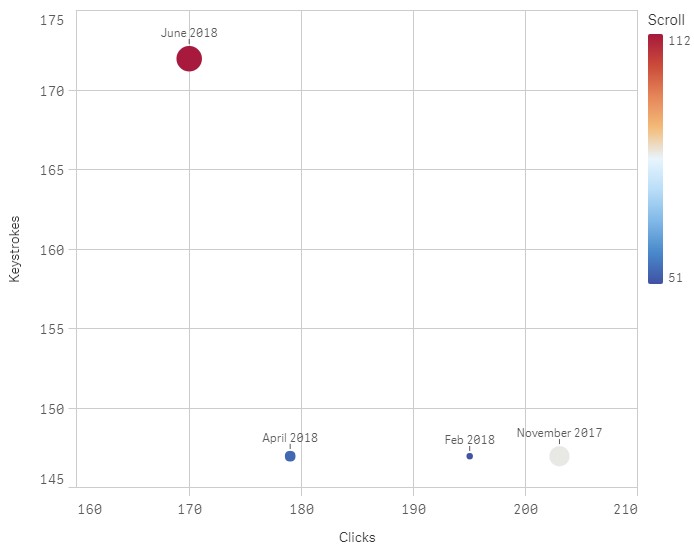
The scatterplot above shows the number of clicks to insight has decreased as well, but interestingly scrolling and the number of keystrokes has increased. This makes sense since the Insights Advisor promotes the use of natural language to generate visualisations based on your focus area, increasing the use of your keyboard while reducing the need to click and build a chart from scratch.
The development workflow has changed dramatically!
Previously, the user needed to think about how to visualise the data before ever seeing it. For less data literate users this can be a complex and daunting task. However, now you focus on the data, selecting the fields you’re interested in and Qlik Sense will provide generated insights and recommended chart types, as well as alternatives.
By stripping away the need to think about visualising the data, you make even the biggest ‘Data deniers’ feel more comfortable and confident working with data.
To summarise, Qlik’s continuously evolving platform has become more usable, effective and efficient, despite becoming more powerful (complex) at the same time. You could say, the true power of an analytics platform is how intuitive and accessible it is, and my biased view is that Qlik offers the best in class.
Funnily, what I’ve discovered through building these dashboards is how frustrated I got when working with the versions pre-April 2018. The Chart Assistance and Insight Advisor is something I’ve already come to rely on to get me up and running quickly.
In the near future, I would like to see the Global Library, mentioned in Qlik’s 2018 Statement of Direction, be introduced. This will further reduce the need for business users understand the complexities around associations and data modelling, allowing them to focus purely on gaining insights. Having said that, this must be more than just a data model library, which I’ve heard recently, and also include global master measures, dimensions and visualisations.
Topic: Data analytics


Comments