

The pivot table has fast become one of my favourite objects in the Qlik Sense native chart library, and it has its place in every app I build. This is because of its powerful and flexible manner, offering more interaction than making selections alone. What I want to look at in this post though, is how to take a dull, colourless pivot table and transform it into an eye-catching object that draws your users’ eyes to the cells that matter.
Identifying positive and negative trends
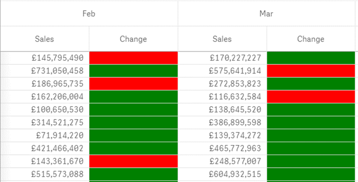
One typical use of the pivot table is to present week-on-week changes or monthly comparisons. Rather than just showing the change in percentages or in absolute numbers, you can add a background colour to the cell that indicates a trend or a rating which allows the user to get a quick overview of whether the measure has increased or decreased.
The example below shows how monthly changes in sales are highlighted by the colours red and green, where red indicates a decline and green indicates growth.
To accomplish this, you need to define the measure first. In this case, the column ‘Change’ is defined as:
Num((Sum([Sales price]) – Before(Sum([Sales price]))) / Sum([Sales price]),’0.0%’)
In this expression, the Before function is used to subtract the previous month’s sales amount from the current month, and the resulting difference is divided by the current month’s sales amount to get the difference in percentage.
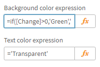
To add the colour, simply use the conditional background colour expression of your measure. For example:
=if([Change]>0,’Green’,’Red’)
If there is no need to display exactly how much the value has changed and the user only needs to know if the value has increased or decreased, you can blank out the number using the colour keyword ‘Transparent’ in the text colour expression:
=’Transparent’
In this example, we have used colour keywords which is a web colour standard supported in Qlik Sense. More on supported colour functions in Qlik Sense can be found here:
Highlighting outliers
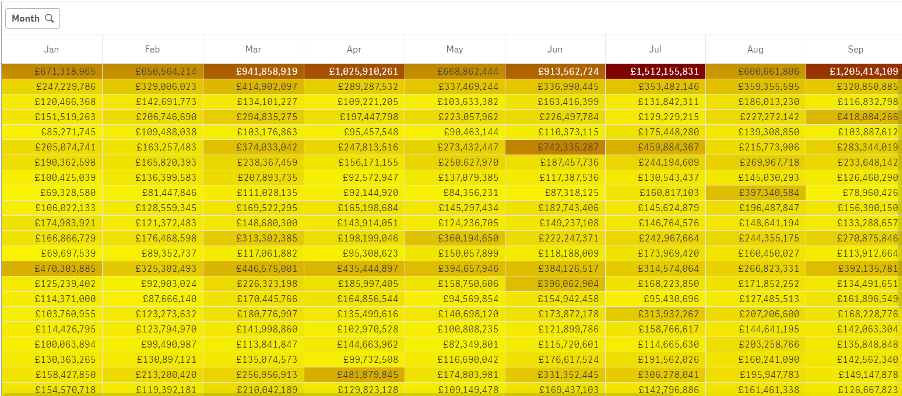
The heatmap chart is a great option when you want to highlight outliers in a comparative data set. Other chart types that may come to your mind are the box plot and the distribution plot where you can quickly identify outliers. However, these chart types are limited to two dimensions and one measure, limiting the ability to drill down into multiple dimensions of your data. When you quickly want to detect comparatively high and low values in a pivot table, with the ability to group the data and drill down, the Colormix function is a good option.
The function Colormix1 returns a colour representation of your data from a two-colour gradient, based on a value between 0 and 1. In other words, you need to create a relative expression using your measure that results in a value between 0 and 1. An example of this is shown below:
Colormix1(
(Sum(Sales) – Min(TOTAL Aggr(Sum(Sales), Month, District, County)))
/
(Max(TOTAL Aggr(Sum(Sales), Month, District)) – Min(TOTAL Aggr(Sum(Sales), Month, District, County)))
,Yellow(),Red())
To clarify what this expression does, it divides the considered sales value with the maximum sales value of the total data set. It also subtracts the minimum value of the total data set from both the considered value and the maximum value to get the true position of the considered sales value in the relative range of data in question. Also, note that the maximum and minimum values are aggregated over the dimensions used in the pivot table. In this case, the values are aggregated over three dimensions; month, district and county. More dimensions can be added depending on how many groupings are used in the pivot table.
The result of the colormix expression is a coloured matrix, highlighting the higher and lower values by the colour of your choice.
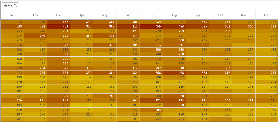
The figure below is another example of using the colormix function where the count of sales transactions has been used as a measure to display higher and lower numbers of occurrences in a frequency matrix:
Summary
As the number of fields and values in your pivot table grows, you may lose the ability to get a quick overview of the data, meaning your users can quickly get lost in an ocean of digits. The background colour expression can serve as an option when you want to highlight trends in a pivot table using entire cells to paint a picture for the user. Highlighting outliers in your pivot table using the colormix function is another way of giving the user a quick overview and the ability to prioritise critical business areas.
If you’d like to find out more about using pivot tables, get in touch with the Ometis team today.
By Mats Severin


Comments