

When providing guided analytics to users the data visualisation of a table can be improved if that table is made dynamic. A dynamic table shows dimensions and measures based on the user’s selection rather than a static table with predefined fields. The user may select dimensions and measures of their choice and the table will adjust accordingly. A feature like this can be useful when the number of columns and rows increases in a table and you don’t want the abundance of fields to compromise the visualisation and overwhelm users with noise. This selective view, simplifies the presentation of the data and allows all users to get at the information they are interested in seeing, rather than showing them additional data that isn’t important to them but is for other users.
Using the Pivot Table chart and conditional columns
The native pivot table is a powerful chart that allows you to analyse multiple dimensions and measures at once by grouping your data, displaying sub totals, expanding and collapsing rows and columns. But even the pivot table may get a bit overwhelmed when the number of fields increases and does not give you those quick answers anymore.
Using the dynamic nature of the pivot table can help you overcome the challenge of multiple dimensions and measures as your data dimensions/metrics grow. With the functionality of conditional columns, also available in the straight table, in combination with a field/metric selection mechanism, you can add and remove columns of your choice instantly.
It’s worth noting there are various methods to achieve a dynamic table. We typically recommend one of two approaches depending on the requirements. The first is to create a data island with the fields/measure in the load script, this benefits from being able to select multiple fields/metrics to display. The second is to use the Variable input extension that Qlik supports, the benefit of this approach is that it doesn’t show your selected choice in the Selections toolbar by default and you don’t have a data island forming part of your data model. For this post, I will focus on the first approach, and here are the 3 steps required:
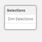
1. Create an inline table in the load script that will serve as your selections table.
Identify all the selectable fields that the user should be able to add and remove from the pivot table. List the selectable fields in an inline table in the load script like the example below. The inline table should act as a data island and should not be associated with the other tables in the data model.
Selections:
LOAD * INLINE [
Dim Selections
Transaction ID
Date
Postcode
Area
]
Optional step: You can prevent these selection fields appearing in the Selections toolbar, field list, insight advisor and Smart search by setting hidePrefix or hideSuffix.
2. Making use of the conditional show or hide column.
Add the pivot table chart on a sheet and add all selectable fields to the column and row segments of the table as desired. Under each field, in the properties panel, use this code in the “Show column if” expression editor (fx):
if(SubStringCount(GetFieldSelections([Dim Selections]),’Transaction ID’)=1,1,0)
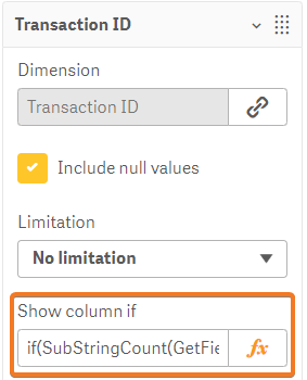
To clarify what this conditional statement does, it shows the column if the value “Transaction ID” has been selected in the “Dim Selections” field.
To be more specific, the GetFieldSelections function returns all the selected values in the field “Dim Selections” in our recently created inline table. The SubStringCount function counts how many times our value “Transaction ID” occurs among the selected values. Finally, the IF statement checks if “Transaction ID” occurs among the selections and returns a true or false (1 or 0) if the condition is fulfilled.
3. Add a filter pane for selections.
Lastly, add a filter pane to the sheet with the field “Dim Selections” where the user can select the available listed fields. When one or more selections has been made in the filter, the fields will populate the table consequently.
Optional step: if no selections have been made, the pivot table will return the message “The calculation condition is not fulfilled” for every field that this applies to. To tidy this up in the user interface and direct the user to make selections, you can make use of the calculation condition option for the entire table and a displayed message if no selections has been made.
Go to the properties panel of the table and the section “Add-ons” followed by the subsection “Data handling”. In the Calculation condition expression write this code:
if(GetSelectedCount([Dim Selections])>0,1,0)
and in the Displayed message expression write something like this:
=’Select fields in the Dimension Selections filter pane’
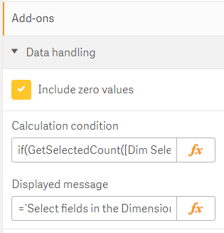
The displayed message will appear in the center of the pivot table if no selections has been made in “Dim Selections” filter.
Why not use Master Items to drag and drop?
To drag and drop predefined master dimensions and master measures to build your customised pivot table can serve as an alternative solution to the dynamic table. After all, the master items are by default a functionality in Qlik Sense that allows the user to explore and reuse ready-made dimensions and measures.
However, it requires the user to edit the application and create a new personal sheet. This personal sheet may be shared with other users but the same process will be required for the next user who wants to customise the table again.
The dynamic table is therefore a more accessible and general option that only requires the user to make selections in the application.
Want to make better decisions based on data?
As the UK's #1 Qlik partner, we can help you with Qlik implementation, training, or support.

Most businesses know their analytics could perform better.
Our independent audit identifies what's holding your platform back and shows you how to fix it. Find out what's slowing your analytics down and how to fix it.

Topic: Data analytics


Comments