

In the recent Qlik Sense June 2019 release we saw the addition of the P&L Pivot to the visualisation bundle, an extension bundle supported by Qlik.
This sought-after capability, to style a pivot for profit and loss reporting, is a welcomed sight. Featuring advanced custom formatting options, you may look at it and wonder how do you use it and is it any good?
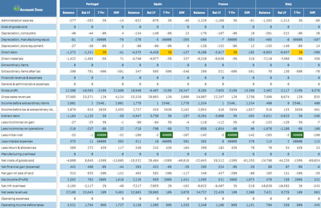
Firstly, let’s take a look at some generic examples. Below we have two examples, the first with banded rows and colour by performance (cell highlighting) enabled.
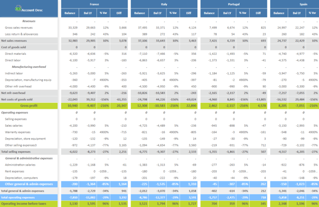
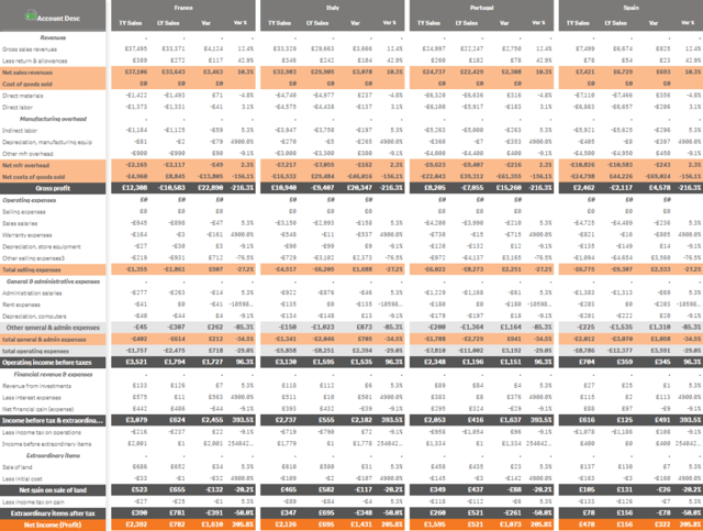
The second has advanced styling applied at a row level.
P&L Pivot – Getting Started
First things first, you need to get your data in the right format. After creating a few of these, I found that starting with the data in the P&L Pivot and building the structure works best. To begin, add the P&L Pivot table to the sheet and add your dimensions and measures. It’s interesting to note you can have a maximum of two dimensions (one along the left/row and one along the top/ column). And, depending on how many dimensions you add, you can have up to nine measures – I found this to be plenty.
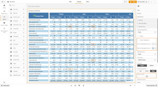
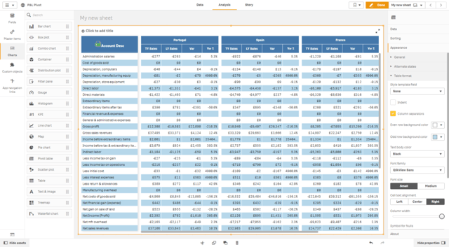
Row banding is enabled by default, this can be modified by changing the background colours for odd and even rows. I will also bring to your attention at this point a couple nuisances. First, the column widths are on the narrow side and you end up seeing the pesky three dots, highlighted above. To enlarge these go to Appearance > Table format and slide the column width slider all the way to the right – it’s not great but it’s the best you can do. Next, if you have more than one dimension, a dimension along the top, it’s much easier to see the wood for the trees if you tick the Column Separators option.
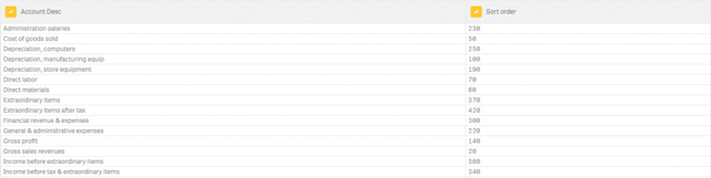
Now we have the structure defined, let’s focus on the formatting. We will start with the sort order of the accounts, along the left-hand side. There are multiple ways to do this, a simple user-defined method is to assign a number to each dimensional value (account). To do this, in view mode click on the excel icon to export the table.

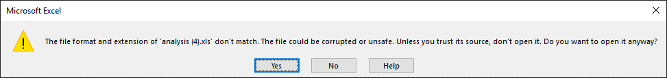
When opening the exported file, I get the warning message below. This is very annoying! I’m hoping this will be fixed in time, but to proceed you simply click ‘Yes’.
With the account exported, the users can allocate a number to each account to represent the sort order. The developer can then read that file into Qlik and use the sort value field as the sort order.
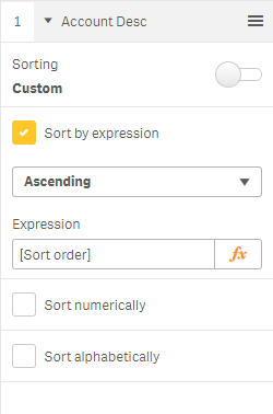
To apply, in the properties panel of the P&L Pivot table, under Sort > Field Name turn off the auto Sorting switch. Then, tick Sort by expression and select the sort value field, like so:
Now we can move onto the advanced formatting. The style template can be an inline or any other data source, but it needs to be able to cope with values containing commas and semi-colons, as these are used frequently in the styling template. Therefore, you may need be cautious with the delimiter you use.
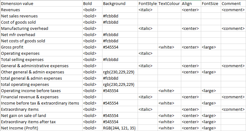
The options available in the styling template are noted below, and in the required format:
DimensionValue;Bold;Background;FontStyle;TextColour;Align;FontSize;Comment
Here are the descriptions, taken from help.qlik.com:
– DimensionValue: The dimension value of the row that you want to style.
– Bold: Set to <bold> if you want bold text.
– Background: Set a background colour. You can use <dark>, <night>, <soft>, <red>, <orange>, <violete>, <blue>, <green> or a colour code in RGB format, for example rgb(183,219,255). The default background colour is white.
– FontStyle: You can set the font style to <italic> or <oblique>.
– TextColour: You can set the colour of the text to <white>. The default background colour is black.
– Align: You can centre align the text with <center>. The default alignment is left for text and right for numeric values.
– FontSize: You can set the font size to <large>, <medium> (default) or <small>.
– Comment: You can use the <comment> tag to replace all zero values with a space. This is useful when you want to include a sub header row without values.
It’s interesting to note that the only mandatory value is the dimension value, the rest are optional. And, you don’t have to list every dimension value in your table, only those you want to format. All options should be semi-colon delimited in a single field.
To keep it simple, I design my spreadsheet with each option in a separate column, then I concatenate all the columns into a single string on load.
Spreadsheet:
LOAD statement:
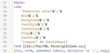
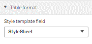
Once you have built and loaded your style template and loaded it into a single field, you can apply it to the table. To do this, in the properties panel, under Appearance > Table format, select the field with your style template in.
The formatting should apply immediately:
Overall, I have found the P&L Table to be a useful addition. However, in the section below I have summarised my positives and, for want of a better word, frustrations with the recent addition to the visualisation bundle:
Positives:
– Advanced formatting at a row level.
– Export the data with advanced formatting to excel.
– Column separators (narrow blank columns between dimension values).
– Colour by performance for positive or negative values is much easier to apply, e.g. simply specify -0.01 to highlight all negative values.
Frustrations:
– Can’t have two dimensions on the top. Therefore, each header must utilise all measures.
– When colour by performance (i.e. whether a cell is positive or negative) it overrides the advanced formatting for the entire row.
– Usual extension limitations.
– Column widths are on the narrow side.
– Not as intuitive as native Qlik objects.
– Warning message when opening exported excel files.
– Colour by performance settings are for all or nothing, it doesn’t have separate settings for each row/column.
– No easy way to add row subheaders/blank rows. Must add them to the data model.
– Not compatible with Qlik NPrinting.
Desirable features
With all that said, I have also listed a few desirable features I’d like to see in the near future:
– Hide the left column/dimension. Therefore allowing two P&L Pivot objects working alongside each other to give more control over varying grouped columns and measures.
– Multiple dimensions along the top.
– Control formatting fully in Qlik Sense.
In conclusion, the P&L Pivot extension is good enough. Yes, it’s a clunky workaround for achieving advanced table formatting but it works very well. What it lacks in intuitiveness it makes up for in effectiveness. I look forward to seeing future iterations of this extension in later release.
By Chris Lofthouse
Follow @clofthouse89


Comments