

Qlik’s mid-year release never fails to get me excited and Qlik Sense June 2018 is no different. In this release, Qlik Sense has impressively extended its reach for less-data-literate users. There are big changes since my last blog on Qlik Sense April 2018’s release.
Qlik Sense updates consistently unleash further features and possibilities within the platform but the leap in time to insight with Qlik Sense June 18 is astonishing. It’s more efficient and boasts eight new improvements and another four new pieces of functionality.
The Insight Advisor is an absolute game-changer, it will evolve how you develop visualisations in Qlik Sense, and for the better. I’m jumping ahead though – let’s roll up our sleeves and take a look at the latest developments in the Qlik Sense June 18 release.
To start, the eight improvements available in June 2018 are certainly impressive.
Publishing from the hub
In April 2018, Qlik introduced publishing an app to a stream from the hub, with the ability to move an app seamlessly between streams. However, there was a limitation that meant you couldn’t republish and overwrite an existing application.
Well, this limitation has swiftly been removed and in addition, you can manage custom properties per application, making it easier for users to manage permissions within the hub. Qlik has also added what everyone has been asking for since the beginning, the ability to approve/publish community sheets to base sheets within an application and vice-versa; unapprove base sheets which will move them into the community sheets. This is handled with a new action that has been introduced within the security rules, rightly named ‘Approve’.
More good news for developers, those pesky thumbnails representing published applications that you own have now been moved into a separate personal stream, named “Published”.

Filtering data from files
If you are a technical user and you don’t use the Data Manager, you really should. Since February 2018 I default to the data manager and only when I need to do advanced scripting do I transition to the Data Load Editor. The Data Manager has come on a long way and now not only makes developers more efficient, it implements best-practice, ensures consistency between developers and therefore promotes developing within teams. The latest addition to the Data Manager is filtering data from files (e.g. .qvd, .txt, .csv, .kml and .xlsx). It’s interesting to note you could already do this on data connections. For data files you have the following conditions at your disposal: =, > , <, >= and <=.
There are some warnings though, Qlik Sense currently does not support filters on date fields from QVD files and there is no support for wildcards as yet. To apply a filter, in the top-right of the data profiling view you will see the filter tab. I attempted to filter data held within a .CSV file and it worked, it was very simple.
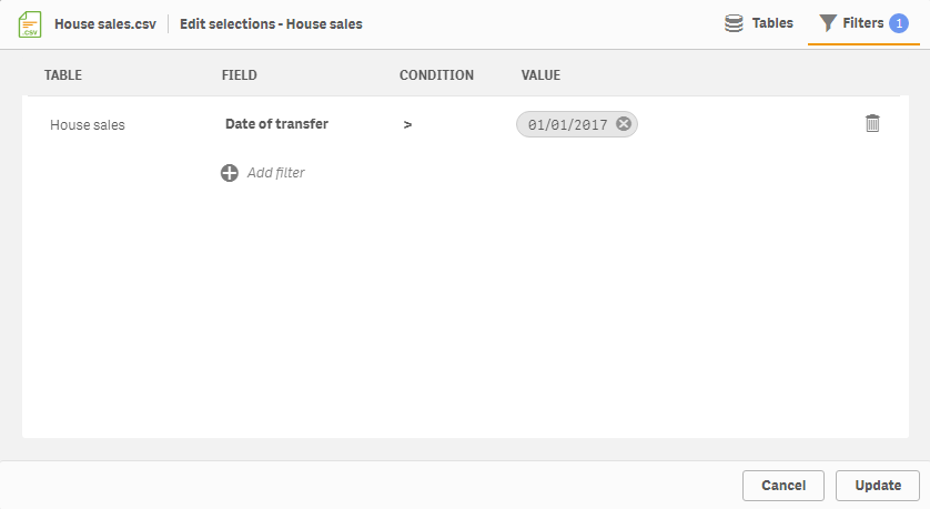
I will add though, applying multiple filters on a single table makes me nervous. This is because there is no mechanism to control the relationship that an additional filter has to the previous filter. Is it an ‘AND’ or an ‘OR’? The relationship appears to be an ‘AND’ except when applying multiple filters on a single field.
Qlik’s help site states:
“When multiple filters are applied to a single field, Qlik Sense will filter data that matches any of the filter condition. Conflicting filters on the same field may result in no data being included, however.”
This implies when adding multiple filters on the same field that the relationship is an ‘OR’, however if you make a conflict then “computer says, no”. I tested this with the following filters:
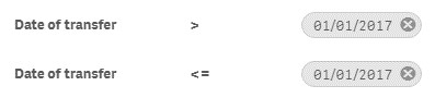
The result was zero rows of data added to my application, interesting! Having said that, don’t let this put you off the Data Manager. I am a big fan – honest. For more complex scripting, you can always unlock the script and synchronise it back afterwards.
Expression Editor
The Expression Editor has a subtle new look, with the addition of a functions and variables list. This is closing off some gap functionality to Qlik View. It makes working with variables easier, DISTINCT and TOTAL clauses now just a click away, as well as having a nice long list of all the functions available instead of having to rely solely on your memory or Google.
[bold]Chart assistance[bold]
In April 2018 we saw the introduction of the ‘Assistance’, now named ‘Chart Assistance’ it not only suggests the most appropriate charts but also alternative visualisations, with a preview.
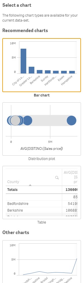
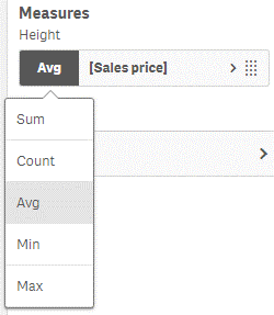
And, if that wasn’t cool enough, something I requested in my last blog has been added… You can now quickly change the default aggregation within a measure, it is also possible to switch the dimensions and measures in the property panel – both possible without disabling the Chart Assistance either, awesome!
Note: During the technical preview I did discover a bug when in Edit Mode, all Chart-Assistance enabled objects would render a blank object, only when clicking on the object or entering View Mode did the object render correctly– hopefully this will be rectified soon or by the release, we will keep you updated.
Visualisation improvements
The mini-graph used for scrolling can be turned off for line chart, bar chart and combo chart. This is useful for when you want to add a relatively short chart and the mini-graph scrollbar was almost the same size as the actual chart. Unfortunately, I could only disable the mini-graph scrollbar when the chart has a continuous scale. Potential bug?
Show and hide specific columns in a straight table using expression conditions is another new capability, this is a useful technique of controlling when a calculation should be performed, particularly if you have large amounts of data or resource-extensive expressions. Annoyingly, you can’t seem to reference a column if it’s hidden however, which I used to do occasionally in Qlik View – perhaps an improvement for the future?
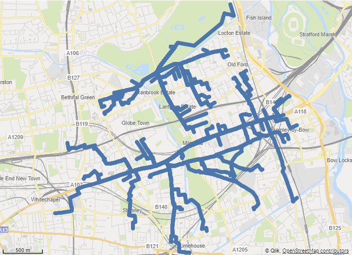
Line layer
Another layer, the line layer, has been added to the native map component in Qlik Sense. Permitting users to plot routes (line geometry) or a start and end-point. In this example, I’ve plotted several routes over east London. You have the ability control the line width via a slider or expression the curvature of the line and add an arrow head.
Grid size
Small, medium and large grid sizes which appeared in April 2018, have already been renamed to wide, medium and narrow. The default grid size still being the same number of blocks. In June 2018 however, you can change the grid size of sheets with existing objects. I will now start using this in environments born pre-April 2018!
Accessibility improvements
Screen reader tags and keyboard navigation for tables and been introduced to further improve Qlik Sense Accessibility.
And finally, onto the shiny new features Qlik Sense has to offer.
Qlik Connectors
Five new connectors have been added to the ODBC connectors package, in no particular order we have:
1. PrestoDB: query all the data sources in an environment that have been configured with Presto.
2. Apache Drill: access non-relational data stores (beta version).
3. Apache Phoenix: access to relational data stores (beta version).
4. Apache Spark: direct SQL and HiveQL access to Apache Hadoop/Spark distributions (beta version).
5. MongoDB: access to MongoDB, which is a NoSQL database program.
Flip to table (fast change to ex-Qlik View users)
Another piece of gap functionality bites the dust, this time in the form of flip to table. Users can now switch (flip) most charts into the underlying table of data and back again. Very nice! From what I could tell, this feature is not compatible with the Map component.
Extend sheet
An interesting feature added in June 2018 is the ability to extend a sheet vertically, permitting your dashboard to scroll; much like a web page. By enabling the Extend Sheet property in the sheet properties, followed by clicking Extend sheet , Qlik Sense will add roughly have the original vertical space to your dashboard. You can also simply drag an object over the Extend Sheet location and it will automatically extend the sheet and add the object to it.
I like how Qlik have implemented this, clearly some thought has gone into it. Also, after clicking Extend Sheet over 20 times, there doesn’t seem to be any immediate cause for concern around how much you can extend the sheet by. While testing this feature, I kept accidentally scrolling/zooming in an object my cursor was over, therefore I’d recommend using the Narrow grid spacing and leaving a single-block padding along the right-hand side.
Insight advisor
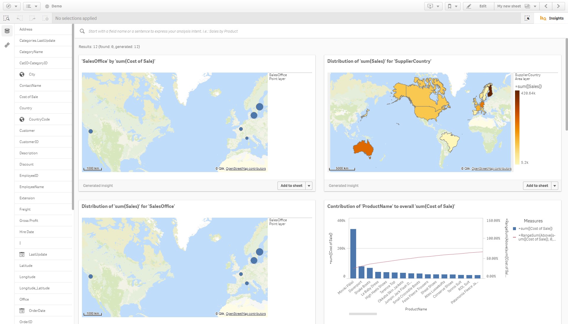
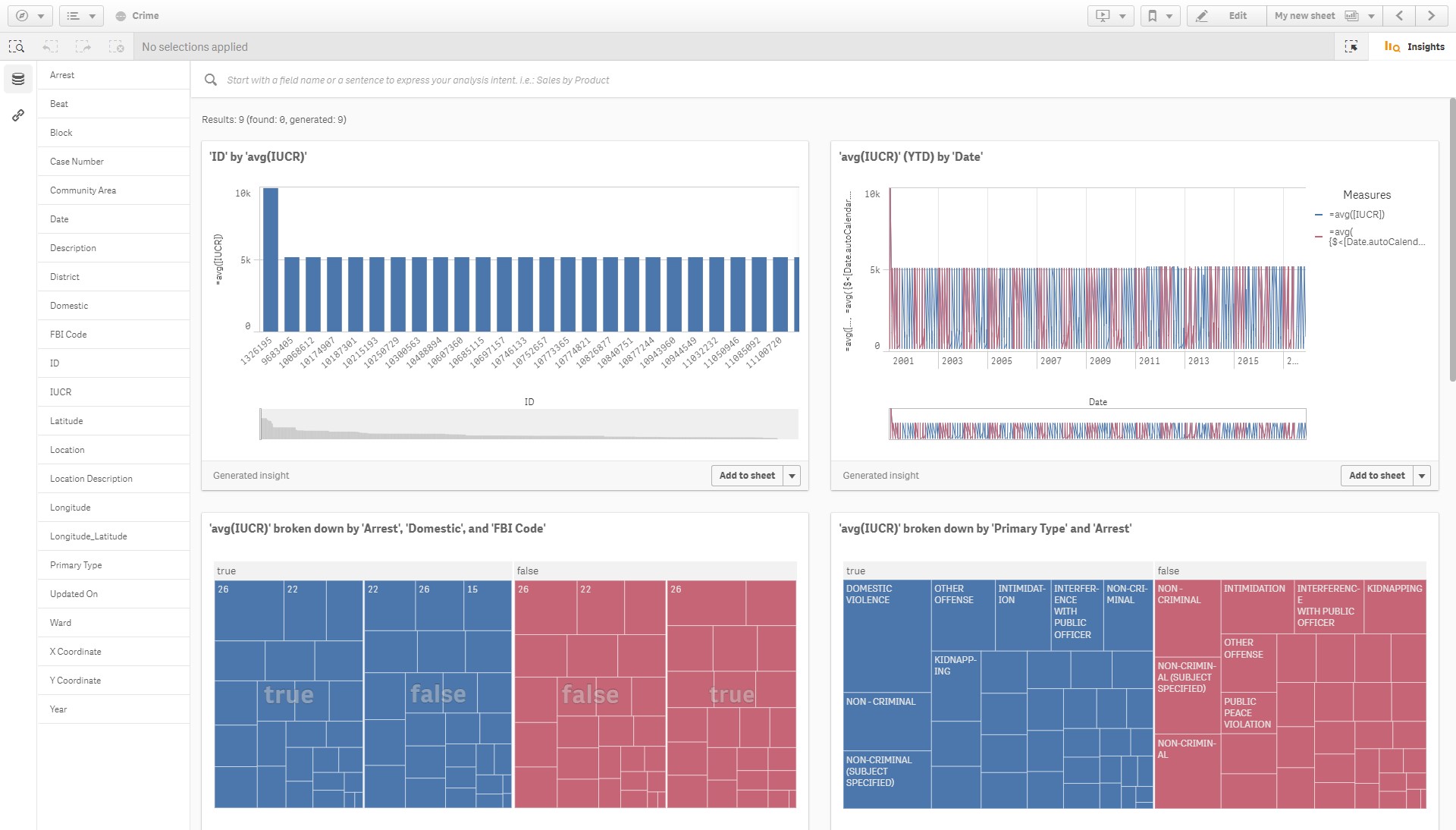
Lastly, we come to the game-changer, the feature which you will love to spend time in, the Insight Advisor. Based on Qlik’s proprietary algorithms, the Insight Advisor will automatically generate views into your data. Through the Cognitive Engine, it will literally suggest and build charts based on the data you throw at it.
I was given access to the June 2018 release a little earlier than most, as Ometis are conducting the Qlik Sense Tour at the Belfry on Wednesday 27th 2018, and with the demo data provided I was simply amazed. I added the data the app and Qlik generated 12 initial charts:
Building charts have never been quicker or easier. To focus your analysis on some particular criteria, such as ‘Gross Profit by Customer’ you can type into the search bar at the top or simply click on the fields in question. Again, it trawled through the data and provided the relevant insights:
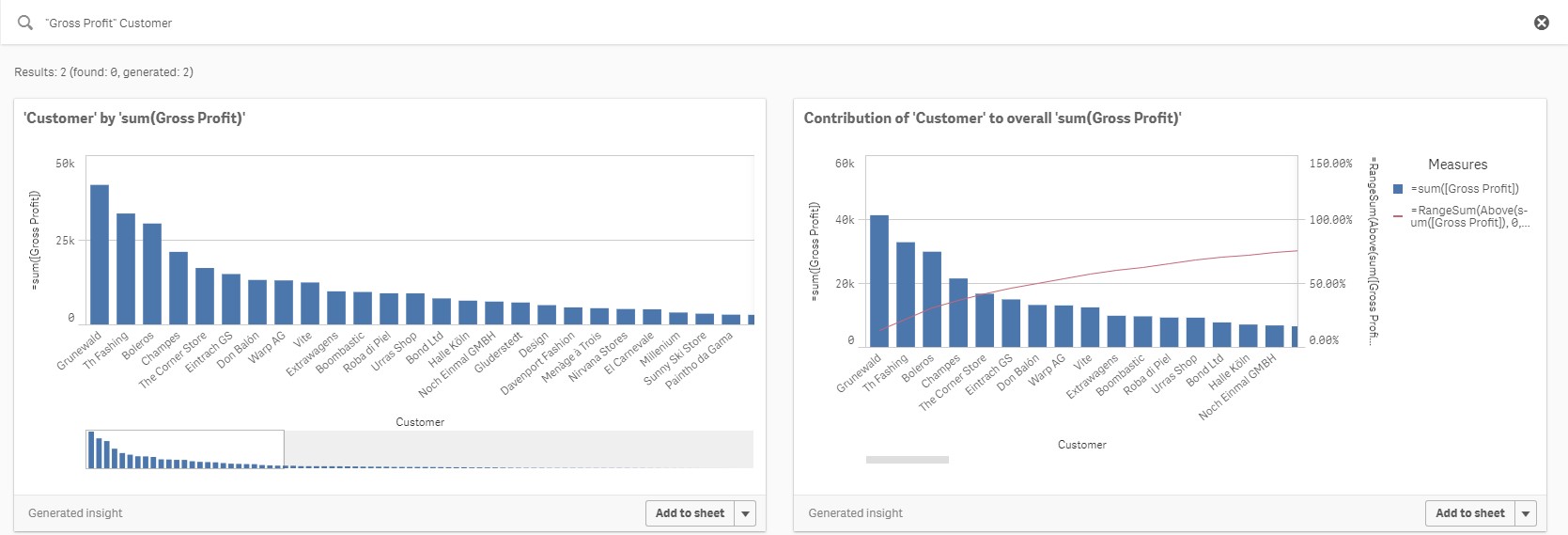
It doesn’t just do basic aggregations, it also does more complex expressions; accumulations for example. This provides users with the ability to perform pareto selections. After several clicks my first insight-driven sheet was finished, despite doing nothing!
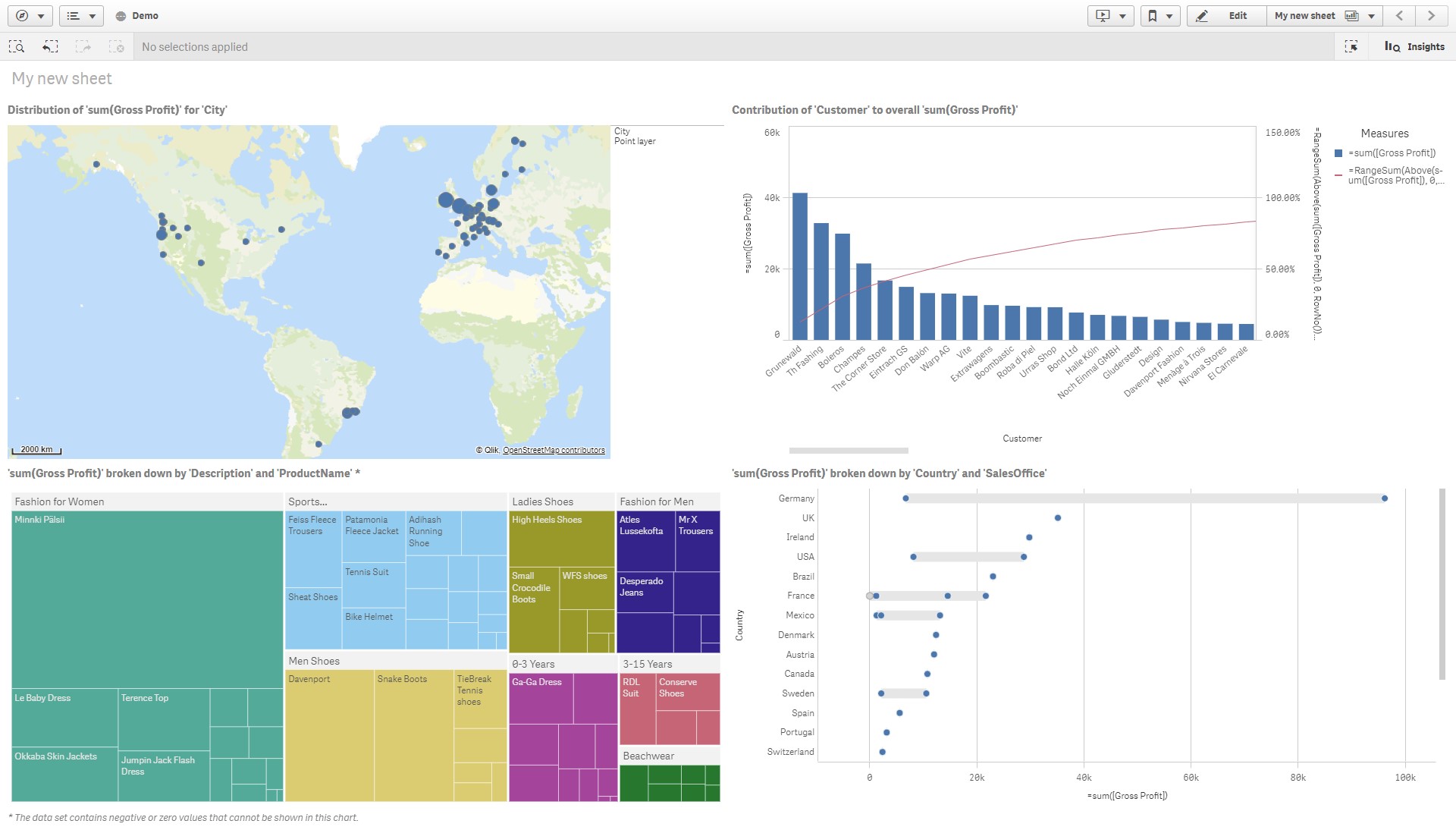
Something I noticed, and rather disappointingly, is that it doesn’t suggest KPI objects! And Yes, it’s not the best-looking dashboard and it does need some input on the layout and titles, but I still did nothing but click.
Since the June 2018 release, I have found myself defaulting to the Insight Advisor as a first point of visualising data. It’s honestly a great piece of functionality and not only does it help kickstart your dashboard development and shorten the time to insights, it also helps you fail faster!
It’s initially release, while a positive step in the right direction, isn’t perfect. Sometimes it generates a visual you may not think of from the beginning but it also, on occasion, builds charts you’d never build. I found this happens more often when you use data sets that aren’t sales or finance-related. When it came to stress testing the Insight Advisor with a wide variety of data sets from Kaggle, I was less thrilled with outputs like this:
In summary, the Insight Advisor works great with geo-spatial, sales and finance related data but can struggle to find meaningful insights with other data sets. It provides more than just basic aggregations, offering pareto analysis, but fails to provide basic visualisations such as KPIs and tables.
I did find that adding your master dimensions and measures first helped it provide more meaning visualisations. Although, there is currently no option to add master items in the Insight Advisor screen which I found somewhat a nuisance; juggling View and Edit Modes. Also, the naming of fields and master items can have a positive or negative impact on its results. Lastly, just because it doesn’t generate the visualisation you may be after, providing it has the correct dimensions and measures in one of the generated insights, you can always add it to the sheet and select one of the other recommended object types provided by the Chart Assistance – reducing the number of clicks to insights.
Qlik Sense Update – Conclusion
The Cognitive Engine has advanced a lot since April 2018, alongside the other 12 changes it’s a great time to be a Qlik partner/customer. Since Qlik moved to five releases a year, in June 2017, they’ve built some serious momentum and I only hope it doesn’t stop any time soon. We are seeing vast strides in Qlik’s platform and I thoroughly recommend upgrading your Qlik site if you haven’t recently – you are missing out!
My three favourite features improved or added in this release are:
– Flip to table, quick access to the data in tabular form.
– Recommended charts – reduce possible visualisation fails by previewing what the chart will look like as other object types.
– And lastly, Qlik’s Insight advisor; reducing the time to insights and further reducing the barriers to insight. It’s not a question of how do we visualise but simply what?
In a future blog I will write a more detailed account of my first experiences with the Insight Advisor and I hope you’ll find it an interesting read.
By Christopher Lofthouse


Comments