

With Halloween now been and gone, we start to draw a close on this rather unusual and spooky year! In this last client-managed release of the year, the Qlik Sense November 2020 release is a solid rounding-off to the product. Expect to see a new default theme, a couple developer efficiencies, images in tooltips and vocabulary lessons! In addition, SaaS users can expect an alert or two…Let’s take a closer look at Qlik Sense November 2020.
New Default Qlik Sense theme
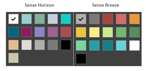
Let’s kick things off with the new default theme in the November 2020 release of Qlik Sense, called Sense Horizon. Sense Horizon is more on brand with Qlik’s corporate colours and is meant to give a ‘fresh’ and ‘modern’ look. However, when compared to Sense Breeze, the previous default theme, it looks a bit more dull and gloomy in my opinion. On a positive note, it steers clear of sharp reds, ambers and greens, preventing any unintended connotations that go with them.
Insight Advisor Updates in Qlik Sense November 2020 Release
There are a couple enhancements to the Insight Advisor in the November 2020 release of Qlik Sense:
K-means Clustering – Expanded Functionality
K-means clustering was first introduced into the Insight Advisor 10 weeks ago in the September 2020 release of Qlik Sense. In a nutshell, a K-means cluster chart in Qlik Sense will group dimensional values, using colour, into cluster groups.

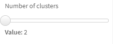
In Qlik Sense November 2020, however, they have improved the clustering function by automatically calculating the optimal number of clusters present. As I didn’t have access to this particular capability in the last technical release, I’ll also note that you can override this in the properties using the number of Clusters slider:
Insight Advisor Visualisation Alternatives
The second improvement to the Insight Advisor is the ability to show and implement alternative visualisation types. This is the same as when you create a visualisation using the chart assistance and is great. Unfortunately however, this wasn’t working for me in the technical preview, but I’m sure it’ll be fixed in the official release. The benefit of alternative visualisations in the insight advisor is that anyone can play around with it, even analysers. This makes answering those ad-hoc questions super easy and now using your preferred chart of your choice, that you can comfortably interpret.
Images in Custom Tooltips
One of the more useful features to have come to the Qlik Sense platform this year is custom tooltips. This enables Qlik users to add additional measures to the ‘hover over’ tooltip, over and above the measures utilised in the core visualisation. This means there are up to three modes, depending on the visualisation; Basic, Custom and Off:

- Basic: This is the standard measures that are used to render the visual.
- Custom: Additional measures to complement the visualisation.
- Off: Don’t show a tooltip. This is available in the Map object.
In Qlik Sense November 2020 the Custom mode has been extended to allow images, which was a previous feature gap to the previous Idevio GeoAnalytics map object – back in the day.
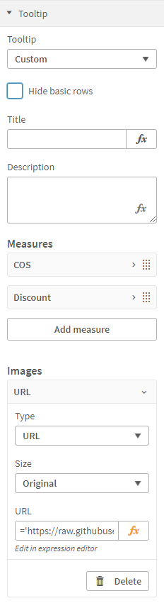
The Qlik Sense November 2020 version permits users to add images from a URL or the media library. The media library option is simple and the same approach to selecting an image for a thumbnail or the text and image object. The URL option allows users to specify the URL address, which can be dynamic! This means you can provide an expression which evaluates on the fly, based on the users’ selections or the data value they hover over.
For example:
='https://raw.githubusercontent.com/hjnilsson/country-flags/master/png100px/' & CountryCode & '.png'Lastly, you can choose from four different Sizes; Small, Medium, Large and Original. The latter being the original size of the image, with a maximum size of 340px x 340px. When using this feature on Qlik’s SaaS tenants, you will need to remember to whitelist the URL of the image in the content security policy.
Copy sheets between apps
What a time saver! A true design efficiency. The ability to copy sheets between apps is a great addition. In the past, I felt this was where Qlik Sense fell short in the development cycle – but then the ability to approve community sheets came into the platform in June 2018 and that need reduced somewhat. I’m happy to finally see this in Qlik Sense though, and now you can copy a sheet from your unpublished sheets, community sheets or public/base sheets from one app to another, regardless if it is published or not. Therefore, you can copy an entire sheet from an app in your work area to a published app in a different stream, and vice versa. Providing the app resides in the same environment you can freely copy sheets between them, it does require the fields/master items used within the visualisations to be present in the app in order to render, as you might expect.
When copying sheets to published apps, the sheet will be placed in your sheets, which no one else can see by default. To copy a sheet, simply right-click on the sheet thumbnail in the app overview or sheet selector and paste it in the same area of another app:
Copy measures between objects
In the same way you can copy sheets you can also copy measures between objects, not necessarily on the same sheet or in the same app. This is another time saver and will save many clicks along the way too. As you may have guessed, to copy a measure simply right-click on the measure, click copy and paste it in your object of choice, whether that’s on the same sheet, in the same app or a completely different one. The only limitation is copying between environments but I don’t think that’ll impact most people.
Hide chart disclaimer
In the November 2020 Qlik Sense release it’s now possible to hide those pesky disclaimers. Although useful and informative to the end user some of the time, they can take up quite a bit of real estate when on small devices or low resolutions. Therefore, under the Appearance > General section of the prosperities menu you can now switch them off.

The unfortunate news here though is that it’s only possible to hide this in Edit mode of a sheet. I would have liked to be able to control this in the Exploration menu and the properties of a snapshot – perhaps next time.
Additional chart improvements in Qlik Sense November 2020 Release
- Increased measure limit in the Waterfall chart, now supporting 50 measures (from 15)
- Extended functionality in table mini charts, including others, and null
Business Logic – Vocabulary
It’s crazy to think that Business Logic only came out in September 2020 and already has a massive improvement! If you missed my review on the new Insight Advisor Chat you can catch it here. Annoyingly for me, it means I now need to update my post to include this part (Vocabulary), but it’s great for Qlik SaaS users and client-managed users who previously had Qlik Insight Bot and can now upgrade/migrate to the latest conversing robot.
Vocabulary allows users to add synonyms and search terms to their data. This will aid in customising the natural language processing, effectively giving the Insight Advisor a means to learn your business language and terminology – including all those ridiculous acronyms you probably throw around the place. It does this by providing you the ability to map search terms, such as a collection of synonyms to a particular field, with optional conditions. Let’s take a look.
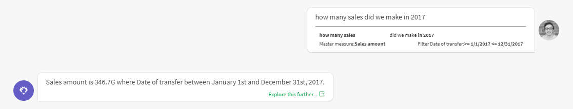
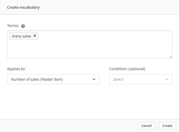
In my example app I have a master measure titled ‘Number of sales’, however when conversing with humans I don’t always say ‘What’s the number of sales for …’. Instead I may say ‘How many sales did blank achieve?’. These are two differently worded questions with the same answer. In some cases, Qlik’s Insight Advisor Chat will still be able to answer your question regardless of how you word them, but you may find yourself needing to educate it from time to time. So, if you find that Insight Advisor Chat doesn’t always answer your questions as intended or is unable to do so, then Vocabulary is there to help.
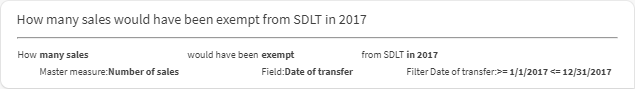
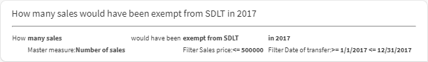
For example, I want to know how many sales were made in 2017. When asked of the Insight Advisor Chat it return the monetary amount and not the count.
Let’s fix this by first adding our terms and mapping it to a field or master item. You can add one or more terms, press enter after each one to lock them in or the backspace to delete them.
Now that we have created our Vocabulary, Qlik Sense will automatically relearn and process the entire business logic – so expect a slight delay before it can answer your question with the new logic again. Once it’s caught up, you should start seeing more meaningful responses.

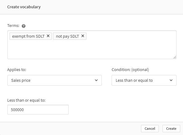
To take this one step further, let’s add a condition. And this is powerful. Conditions enable you to educate the Insight Advisor Chat, giving it the ability of interpretation. This is the fundamental business language and definitions that you use on a day to day basis without thinking about it. That’s unless you are new to the business, and you spend your first month asking what does that acronym mean or for example, let’s take the UK Government, who advised people that are ‘at-risk’ should self-isolate – well at the start of the pandemic we were all asking which age groups or medical conditions do they mean? Vocabulary allows users to define those definitions of your business language.
Recently in the UK, the stamp duty land tax changed, increasing the threshold of the property value before any tax is liable. So I want to compare sales this year vs historical years to see the impact that has made on the housing market. One question I want to be able to ask is ‘How many sales would have been exempt from SDLT in 2017’. Here we combine our previous vocabulary ‘many sales’ with a new term ‘exempt from SDLT’, which also contains the acronym SDLT (Stamp Duty Land Tax).
Oh boy! I think it’s obvious no one would be answer this question without knowing the acronym or what the rates for stamp duty are. So, let’s educate our little robot to interpret this question.
When I ask this question now, Qlik’s Insight Advisor Chat interprets it correctly as follows:
Forgive me for what I’m about to say, I’ve just finished watching The Haunting of Bly Manor, and for the whole time I’ve been reviewing the Business Logic – Vocabulary I’ve been trying to resist the urge to say it’s ‘Perfectly splendid’ – but it is. It works…really well.
But, as always it could be further improved and built upon. I foresee my main frustration with Business Logic is that I have to be in the app to educate it, this is going to become annoying and will possibly see some users give up. For Insight Advisor Chat to be widely adopted, there needs to be a way to converse and teach it through the chat. A way for it to ask questions back about what it doesn’t know or understand and store it. A way to teach and reteach as time goes on. A way to truly converse. Imagine a new starter of a company using their Insight Advisor Chat not only to get insights into the data but also to understand business definitions, logic, acronyms and phrases behind those results. There is a lot of potential here and I’m excited to see this feature further mature next year.
Qlik Sense Mobile Updates
Supporting the latest mobile OS releases (iOS14 and Android 11) for Qlik Sense Mobile and Qlik Sense Mobile for Blackberry.
Qlik Data Alerts (SaaS)
As we all know, at the start of this year Qlik acquired RoxAI who developed Ping Alerting. For client-managed customers, Qlik rebranded and redesigned the interface of the now named Qlik Alerting. In Qlik Sense November 2020 for SaaS customers, Qlik have introduced, as part of the current subscription fee, Qlik Data alerting. A new feature, built from the ground up (but likely based on Qlik Alerting), that lets users create alerts based on data driven events.
![]()
To create an alert is simple, right-click on a chart and select Create alert. Here, you are greeted with a three-step wizard, let’s look at the first step.
1. Details & data:
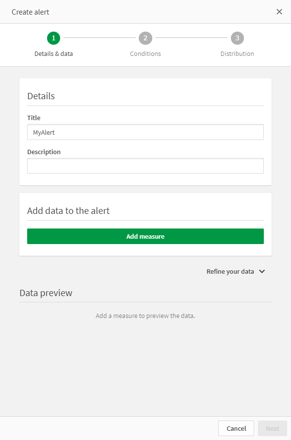
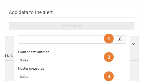
Some of the steps as self-explanatory, like giving your alert a title, so I’ll skip-over those and focus on the more interesting points. The first notable point to make is about adding the data to the alert. You have three options for a measure:
- Add an expression directly in the alert.
- Select a measure in the chart you selected ‘Create alert’ from.
- Or use a Master measure.
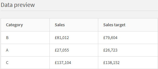
It’s early days, but I’d assume best practice would be to use Master measures as they are easily maintained and definitions won’t be siloed in forgotten alerts! You will want to select all your measures at this point, the measure you want to report on and then any comparison measures. For example, I will add my actual sales and sales target expressions. Annoyingly, it doesn’t pick up the number format from the master measure, you set this money and it can’t be configured – it uses the application defaults from the app variables in the Main section of the data load editor. Next you can ‘Refine your data’. Here you can show by dimension and specify the selection state.
Show by dimension
Again, you have three options. This time you have None, From chart and Master dimensions.
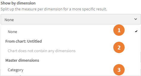
The dimension affects the results sent in the alert. If selected, the results will be broken down by the dimension – as shown in the data preview:
This also provides more granular control in the step 2 – conditions.
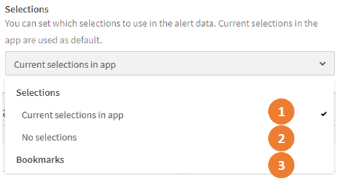
Selections
Selections allow you to set the context of the alert. Therefore, the alert conditions will be evaluated based on the selections applied in this step. As you may have guessed there are three options:
- Current selections in app.
- No selections.
- Bookmarks
2. Conditions
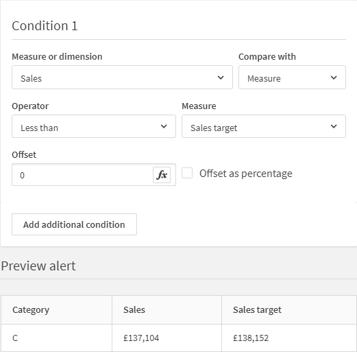
Conditions are what are evaluated and trigger the alert when met. From my initial understanding, an alert can have one or more conditions. A condition can be applied to a measure or dimension. A condition can compare the selected measure against a static value, another master measure or ‘current set’. When the latter two comparisons are selected, users can specify an offset value or %. I assume ‘Current set’ means the current set of dimensional values based on the dimension selected (if selected) and selections – without documentation I’d need to clarify this. The offset permits users to add or subtract a static value or percentage from the comparison value.
The operators available are:
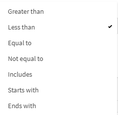
Here I have created a condition that checks if the Sales value, per Category, is less than the Sales target. If evaluated true for any of the categories an alert will be sent to me. The preview shows all values that currently would trigger the alert.
3. Distribution
In the final step, you can specify the frequency and Share with other users.
Notification frequency
Users can specify the upper limit of how often an alert can notify you, here is the current list of options.
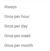
If Always is selected, then Qlik will notify users each time the app is reloaded and the data changes. If Once per day is selected, for example, and the app reloads several times a day, then Qlik will group all the alerts into a single notification. What I’m yet to learn is what time or how Qlik does this. It would be nice to be able to specify the number of alerts to reach before sending a notification i.e. after five notifications or at specific times of the day i.e. 8:45am, 12pm and 5:15pm.
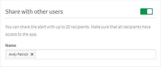
Share with other users
Alerts can be shared with up to 20 recipients, in the client-managed offering this was limited to professional users so I’ll assume the same rules apply here but I haven’t had chance to test yet!
Notifications
Notifications can be sent to the hub and email. When accessing via the hub, you’ll see the bell icon with a green dot – signifying an alert is waiting for you! Open the notification list and you’ll be able to access all your alerts:
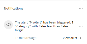
This allows you to view each alert directly from the hub, where you can explore in the app should you wish.
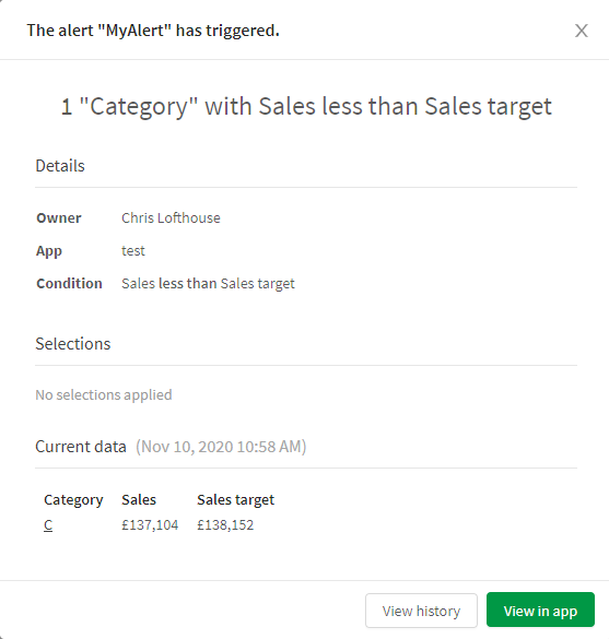
What’s pretty neat here is that you can click on the dimension values and it’ll navigate you to the app and apply that value as a selection automatically – allowing you to dive right into your data.
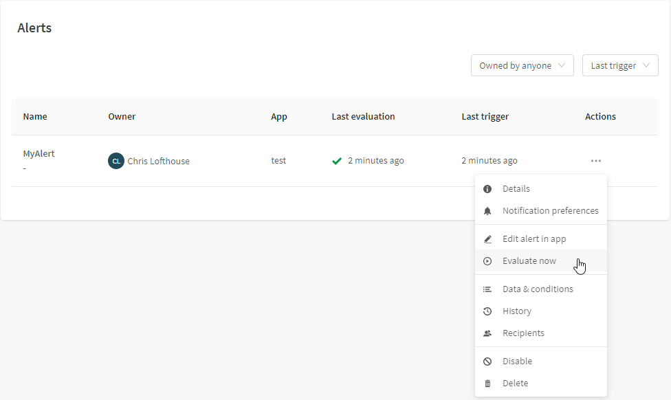
Managing Data alerts
Your alerts can be managed directly in the Settings view of the Hub. Simply click on you account icon and select Alerts:
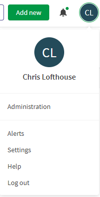
From the Alerts view, users can Evaluate now, edit in app, modify notification preferences, view history and recipients, disable, and delete their alerts.
Overall, I think it’s extremely impressive to see any company acquire a product and have it integrated into their SaaS platform in less than a year, let alone a year of pandemics, lockdowns and US elections! Data alerts in Qlik Sense SaaS is what Qlik users have been asking for, and Qlik have delivered in excellent style. It’s a really impressive first release for this feature and I look forward to tighter integration with the Qlik mobile app.
Qlik Sense November 2020 Release: Summary
I feel Qlik had four focus areas for this release, the first was how to improve development workflow and efficiencies, in reply they gave us the ability copy sheets between apps and measures between objects. The second was to look at what small adjustments can they make to improve user experience, now we can use alternative visualisations in the Insight Advisor, use images in tooltips and hide disclaimers. The third, how to make the Insight Advisor Chat more human – bring on Vocabulary. And lastly, how can we make 2020 a bit better for our customers – Data alerting in SaaS! If Qlik can continue to deliver the quality of releases they have during a year hit by a pandemic then I look forward to what’s to come next year.
Note: Any Ometis customer on our Proactive support offering can choose to use one of their free upgrades.
By Chris Lofthouse #QlikLuminary
Follow @clofthouse89


Comments