

Did you know, as of the June 2020 release, there are 21 native visualisation objects in Qlik Sense. This is up from 17 in Qlik Sense June 2019’s release. These objects can be categorised into three visualisation types: Charts, Text-based visualisations and Dashboard objects.
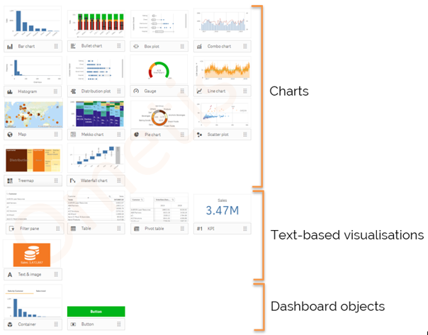
Charts
Charts illustrate the data with visual elements like bars, lines, or points. They are commonly used during the analysis part of the data exploration process. This is because they can summarise large quantities of data, slice and dice data in many ways, and have the ability to drill into the data with ease. There are 14 native chart objects in Qlik Sense June 2020.
Text-Based Visualisations
Text-based visualisations presents data in text form, for example, tables or filters. They are commonly used at the start of the explorative process to provide a high-level summary of data, using KPIs, and also at the end to provide a detailed list of the underlying records, using tables. There are 5 native text-based visualisations in Qlik Sense June 2020.
Dashboard Objects
Dashboard objects enable a Qlik developer to optimise user experience. This can be done in many ways, such as implementing buttons, providing quick shortcuts for frequently performed actions, and improved user interface design by reusing space with container objects. There are currently two native dashboard objects as of Qlik Sense June 2020.
But it doesn’t stop here. In addition to the native objects there are extension bundles that Qlik fully support.
Visualisation and Dashboard Extension Bundle
There are an impressive 13 additional visualisation extensions and three extra dashboard objects that Qlik fully support in the June 2020 release. Below you can see the split:
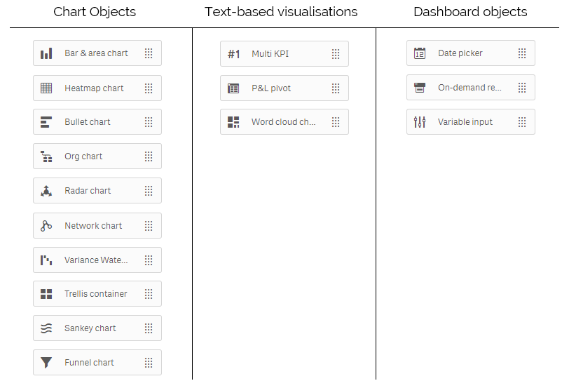
When we say supported, we don’t just mean they are committed to each extension working from one version to the next, but actually improving and enhancing the extensions as well, with the primary goal to migrate them across into the base product, just as we’ve seen with the Button, Container and Bullet chart.
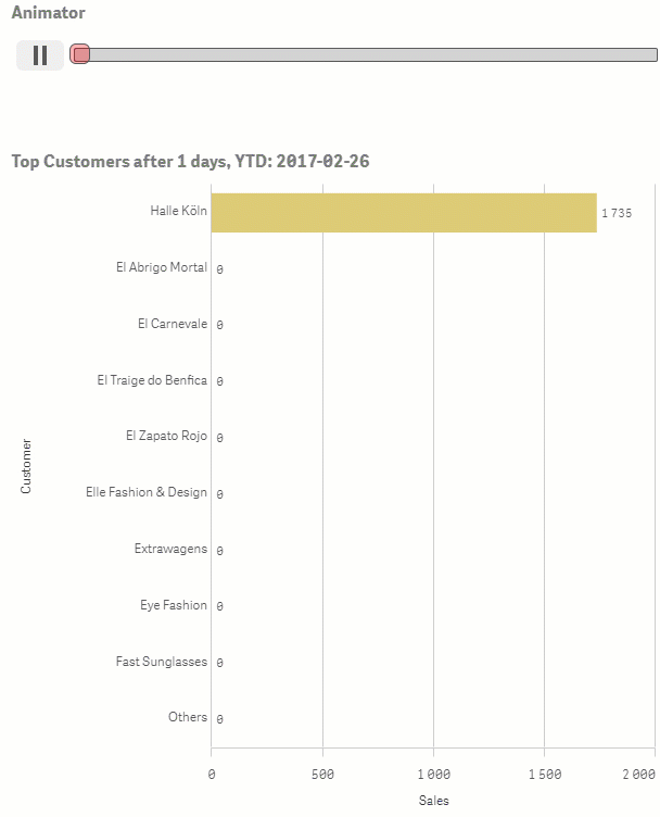
Both libraries continue to grow, with Qlik Sense September 2020 technical preview displaying a new object added to the Dashboard bundle.
Animator object
In the Qlik Sense September 2020 technical preview there is a new Dashboard object being added to the Dashboard bundle – the animator object. The animator object is not strictly ‘new new’. It has been migrated across from the GeoAnalytics extension, formerly a layer of the map Idevio map object. The animator object cycles of a field’s values, commonly a date/time dimension and highlights data movement from one data point to the next. This has become quite popular on social networks such as Twitter and LinkedIn.
The new animator object features:
- Auto selections
- Animate over dimension
- Aggregated or single select
- Loop
- Time based
- Custom sort
- Filter slider
If you are interested in learning more about visualisations then you may be interested to hear last month we announced all our training courses have been migrated into a new format for remote delivery. This includes our Advanced Visualisations course. For more information do get in touch today – info@ometis.co.uk
By Chris Lofthouse #QlikLuminary
Follow @clofthouse89


Comments