

The first Qlik Sense release of the decade is here and you can probably tell by the page’s scrollbar that Qlik Sense February 2020 is a massive release. If you’ve seen the executable size you’ll also notice a big (>200mb) difference compared to the Qlik Sense November 2019 release and it’s easy to see why once you’ve read this review.
Qlik Sense February 2020 – What’s New?
I’m going to kick this off with my favourite new feature as a Qlik developer…
Duplicate measures and dimensions
In the same vain as Master Item promotion had in Qlik Sense September 2019 release, this one is equally as significant. By far my personal favourite addition to this release, despite the tough competition, is the ability to duplicate measures and dimensions with a right-click! Honestly, the time this will save during development phases over the next few months, I’m sure will pay for the time it takes to upgrade. Maybe I’m exaggerating here, I don’t know, but it deserves it. It sounds small, it sounds simple, but in order to copy a measure previously you had to expand the measure properties, open the expression up, select all, copy, close the expression editor, scroll down the properties menu, click Add measure, open the expression editor (or risk lose any formatting you had), click Apply, expand the measure, and set the number formatting…11 steps, seriously? How did we just accept this?
Anyway, this is 2020 and now we right-click and duplicate…AWESOME! I see your 15.06 seconds, Qlik Sense November 2019, and I raise you 1.11 seconds (Qlik Sense February 2020). I seriously timed this, and yes I need to get out more!
Trendlines
For those interested in trend analysis or even those who hadn’t thought about it, it is now possible to add trendlines to line and bar charts in Qlik Sense, a previous feature gap to QlikView. This highly-demanded feature is extremely easy to utilise, appearing under the measure properties of the object. You can add several trendlines to a single chart and even measure – including Average, Linear, 2nd degree polynomial, 3rd degree polynomial, 4th degree polynomial, Exponential, Logarithmic and Power. In fact, it’s so easy to use and informative that I expect most Qlik users will utilise this feature more often than not.
Just like a measure, you can hover over the trendline to see the tooltip and respective values. The trendline also has styling properties to set the colour and whether the line is solid or dashed.
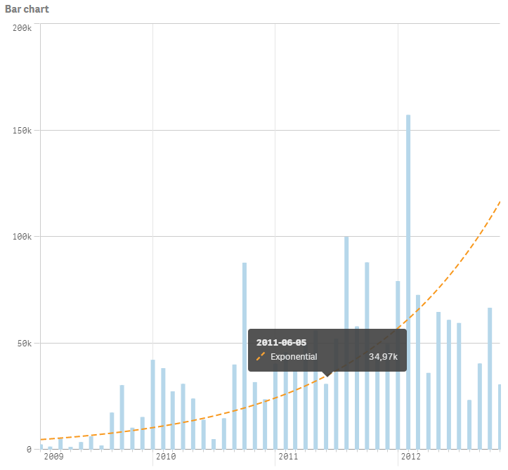
It should be noted that trendlines are only supported for bar/line charts with a single dimension, as group and stacked visuals are not supported.
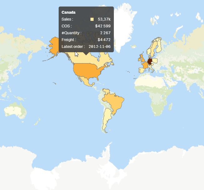
Custom tooltips
Custom tooltips have been on my wish list for a while now, and it’s great to see them added in Qlik Sense’s February 2020 release. With its own section under the appearance tab, in the properties menu, you can disable basic tooltip and customise it with additional measures. Custom tooltips are available for the Bar chart, Combo chart, Map chart, Pie chart, Scatter plot and the Treemap.
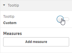
It’s simple enough and provides quick number formatting too.
Having said that, in the initial release custom tooltips do not support set expressions, expressions using the TOTAL keyword and charts with calculated dimensions. Hopefully, full support will follow later this year.
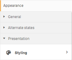
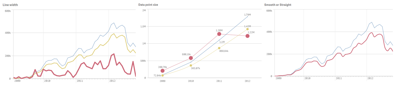
Line chart advanced styling options
The line chart is the latest visualisation to be reworked using Picasso JS framework. It joins the bar and pie chart in offering a ‘styling’ option, under the Appearance > Presentation section in the objects properties panel.
Here, you can set styling options either for all lines or per individual line – pretty neat! Styling options include:
- Line width
- Solid or dashed line
- Straight or smooth line
- Data point size
In addition, you can now change the orientation of the chart from horizontal to vertical. Here are a few examples:
Pivot styling
It’s great to see more styling options come to the pivot table, something finance persons will be smiling about I’m sure! However, I wouldn’t throw away the P&L Pivot table extension just yet. While the native pivot table enables you to now customise the following:
- Header font size and colour
- Cell font size and colour
- Column centre align
- Dimension background and text colour
It doesn’t provide much of the desired functionality that the P&L pivot table does, such as exporting with formatting, spacing between columns and an easier method for performance colouring. Having said that, the latter can be achieved for colour expressions, as well as much of the other colour formatting the P&L Pivot extension can. At least with the native pivot, you don’t rely on external Excel files! In addition, Qlik has confirmed it is looking to add further styling options in the future. Let’s hope it’s sooner rather than later.
My only request for the immediate future is to lose that bit of white space on the second dimension on the left, so the background colour fills the entire cell. For those with a custom theme or using the table styling options, the styling is applied according to a priority order that will override each other:
- Measure settings.
- Styling settings.
- Theme settings.
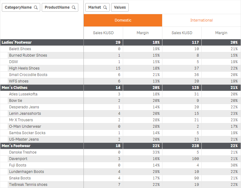
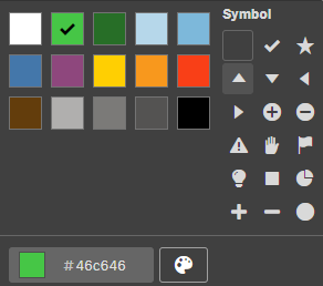
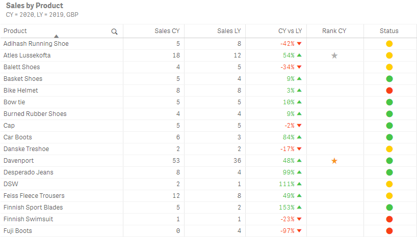
Table Indicators
We now move over to the straight table which now has an easy method to add table indicators, which I think most Qlik Sense users will enjoy. Each measure in Qlik‘s native table can now have the representation of Indicator, instead of just Text. This can help improve readability of a table and highlight performance goals. By changing the measure’s representation to indicator you can:
- Set limits
- Pick icon and colour
- Align icon left or right
- Show value or not
- Colour value or not
- Use fixed or gradient colour
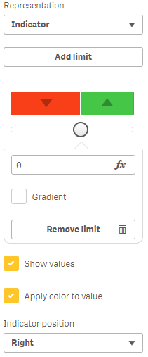
Very similar to set limits in the KPI object, by clicking on a colour segment you are greeted with the colour palette and a list of icons:
The main benefit of table indicators is development efficiencies. As most Qlik developers will know, the end result of an indicator isn’t new, it was possible before with colour expressions in combination with ALT codes. However, the speed and ease at which you can add indicators and colour highlighting in Qlik Sense’s February 2020 release demonstrates Qlik’s dedication to shortening the time from data to visualised to insights. Here are some examples below:
Native Button object
Another new native object has been added to Qlik Sense. This is becoming a regular occurrence, with Qlik delivering on their promise to add more visualisation/object types. In Qlik Sense February 2020, we now have the native button object available to us. Many developers were familiar with the ‘Button for navigation’ in the Qlik Dashboard bundle, but this is better. In addition to all the actions you have available for the button to perform i.e. making selections, clearing selection, navigation, setting variables, applying bookmarks, etc., there are more styling options than before and the UX (user experience) is far more superior.
Styling options include:
- Background colour and image
- Border colour, radius and width
- Label colour, style (bold, italic and underline), alignment
- Font size %
- Icon
- Enable/Disable button
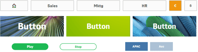
The last thing I’ll say is, the resolution and stretch to width and height of the allocated blocks is a big improvement.
Native Moving average and Difference options
In the Qlik Sense November 2019 release, we saw the Accumulation modifier option appear within a measure’s properties, limited to the Bar chart, Line chart, Combo chart, and Table. It’s nice to see my assumption about more arriving was correct, as now we have had two additional options appear: Moving average and Difference.
Moving average
A moving average creates a series of averages over subsets of data, commonly used with time series. It’s referred to as moving, or rolling, as the subset of data is shifted along from one data point to the next. This is a method of smoothing out steep fluctuations in the data. In Qlik Sense February 2020, you can set the range of the moving average to be ‘Full’, i.e. inclusive of all data points, or custom and dictate a number of steps, i.e. to achieve a rolling 3 months average.
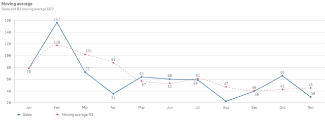
Similar to the accumulation options, you can choose to show excluded values or not, as well as include null values.
Difference
The difference modifier is exactly that – it compares the difference between the value of the current data point vs. the previous. It’s as simple as that. Again, I foresee it mostly being used with time-series data.
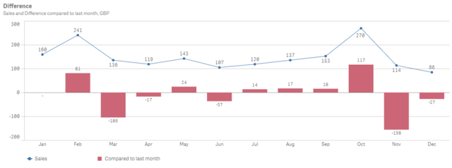
Note that the first data point won’t have a value as there is nothing to compare against, or at least not in this particular object hypercube (data set). It is possible to populate the first value though, so if you are interested, feel free to leave a comment and I’ll be happy to explain how.
Map improvements
There is not one but three updates to the map object in the Qlik Sense February 2020 release: Image point symbols, disable layer selections and background layer show condition.
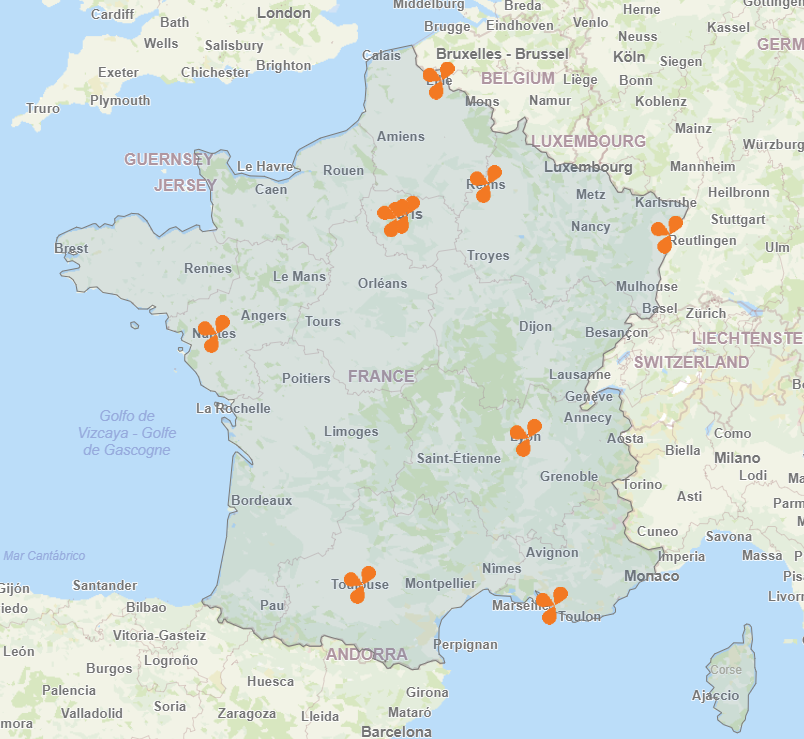
Image point symbols
It is now possible to use your custom images as symbols to represent a point in the map object. This adds a nice personalised touch to any dashboard. For example, showing offices, shops, restaurants, etc. on a map. To do this couldn’t be simpler. In the point layer properties menu, navigate to the Size & Shape section and change the Shape option to Image. Here, it is possible to select the necessary image from Qlik Sense’s media library.
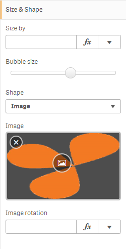
There is also an option to rotate the image. Here, you pass an expression or enter a numeric value i.e. ’90’ will rotate the image 90 degrees clockwise, negative values will rotate the image anti-clockwise.
Disable layer selections
Qlik has acknowledged that not all layers are for selecting from. Some are merely background objects such as borders, with the sole purpose to enhance the visualisation. Therefore, Qlik has added an option to disable selections per layer. This option is found under Layer Properties > Options > General.

Background layer show condition
The background layer, like the other layers, now has the show condition option. Therefore, it can be controlled using an expression – possibly controlled by the new native button.
As mentioned earlier, the map object is one of the objects that the custom tooltip is compatible with. This is great for adding further detail for each layer. It would be great to see the ability to embed media/other Qlik Objects in the tooltip as the Idevio version of the map object had the ability to do. This is one of the few remaining gap features of the migration of functionality.
Font family in themes
Qlik have added the ability to set the font family for text in Qlik Sense charts using a custom theme. However, this setting is noted as experimental in this release. Check out this link for more details.
Funnel chart sort
The funnel chart in the Qlik Sense Visualisation bundle now has standard Qlik Sense sorting enabled. Available as normal through Properties > Sorting, you can sort (ascending /descending) by: dimension, measure, and expression. Sorting is available for all modes: area, height, width (recommended), and ordering.
Qlik Sense & Qlik Data Catalyst QVD Catalog Integration
Unfortunately, I’ve not been able to test this addition so I will quote the release notes directly:
“QVD Catalog Browsing in Qlik Sense enables users to explore the [catalogue] of governed and curated QVD files with little to [no] interaction of a Data Administrator/Provider at the time of analysis generation. A user can search and filter data assets and select them to create or modify a data model in Qlik Sense. The user is then taken to data preparation where data associations can be suggested or made by the user, allowing a self-service data exploration experience and promoting data literacy.”
This sounds great and I look forward to getting my hands on it!
Insights Advisor improvements
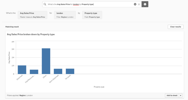
And for the pièce de résistance, Insights Advisor now supports natural language processing, with the ability to type or voice what you want Qlik Sense to visual for you. Using the Qlik cognitive engine, Qlik Sense can detect field name and field value references to build beautiful visualisations with advanced expressions without the user having to create or select anything. Guaranteed to reduce the technical barriers even further I also think this, if marketed correctly within an organisation, will help increase adoption too.
Moving past the WOW factor, for a moment at least, it’s hard to ignore the elephant in the room “GIGO”, Garbage In-Garbage Out. Cleansing of data and the naming of fields and master items is going to become more and more important for users to be able to use this effectively. The main question I have is around naming – is it possible, or will it be possible in the future, to add synonyms to fields and master items, as it will be critical for Qlik to be able to speak the language of the user otherwise it will risk becoming a cause of frustration.
Using the Qlik Insights Advisor is intuitive. By typing or speaking a question, Qlik’s Cognitive Engine can understand the user’s intent by mapping the words used to field names and values within the data. It is possible to check you have been understood by enabling the information icon, located on the right-hand side of the search box.
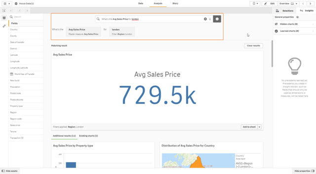
The Insight Advisor will return a matching result along with other relevant insights it generates and will refer back to the existing objects in the sheets that use the same fields.
Any of the generated visuals will have an edit icon (symbol of a pencil) when hovering over them. Clicking this will allow users to modify the make-up of the visual. Users can add, modify or delete measures, customise the filters and educate Qlik’s Cognitive Engine. The main new feature here is the filters section:
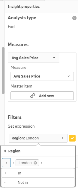
Here, you can select to include or exclude values, and build a complex Set expression using a user interface, no coding required. I see the Insight’s Advisor being a key component of Qlik deployments in the future. This has the ability to answer those ad-hoc questions, on-the-fly (providing the data is present), without the need for technical expertise.
This won’t be the end of the development for the Insights Advisor though. Personally, I’d like to have the ability to suggest the chart type I want it to use and for it to offer predictive analysis too. For now though, I’ll settle for natural language support, oh and extended chart support with the inclusion of the radar chart.
Note: For those upgrading, there are some manual steps required for this to work as it requires updating the SSL certificates. Read the upgrade notes carefully!
Summary
Hats off to Qlik for this release. It’s the biggest we’ve seen for a while and the others haven’t necessarily been small. They have well and truly kicked off the decade with an epic release filled with a lot of useful new functionality and improvements. It’s felt like a marathon just reviewing it, so the effort to put all this together on a 10-week release cadence is testament to the product development and R&D teams at Qlik.
From a developer point of view, the best feature for me was the ability to duplicate measures and dimensions – the simple things in a developer’s life are always the best. However, from a Qlik user’s perspective, natural language support in Qlik’s Insight Advisor is a clear winner. It’s a lot of fun to use (especially if you’re using the microphone) and very informative. Having read and reviewed Qlik’s Statement of Direction for 2020, I am more than hyped to see what the rest of this year brings.
Remember, if you are an Ometis customer with proactive support you can choose to take us up on one of your free upgrades. I’d definitely recommend it, as this release is a game-changer but also because this upgrade requires a few extra steps to perform due to the NLP. Don’t worry, if you’re not already an Ometis customer, our team may still be able to help you upgrade. Get in touch now to see how we can help.
By Chris Lofthouse
Follow @clofthouse89


Comments