

As the rather unusual summer, under various degrees of lockdown, draws to a close, most people have been waiting for their sports to start back up, but I’m probably one of few that have been looking forward to the next release of Qlik Sense. Perhaps that’s a side-effect of this new normality of working from home full time. In any case, Qlik have delivered on some key functionality we’ve all been craving. So let’s take a look at what’s new in Qlik Sense September 2020.
General UI changes in Qlik Sense September 2020 Release
Something to point out to begin with are the subtle changes in the user-interface:
- The Hub now has a new layout view available, introducing table view:
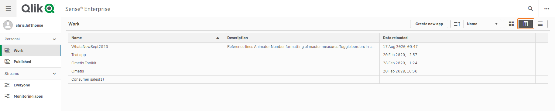
This has the ability to list apps in a table with columns for the app name, description and data last reloaded. For published streams, you will also see owner and Published date/time. In addition, you can:
- Sort by clicking on the column headers.
- Keyboard shortcut just like grid (ctrl + g) and list view (ctrl + shift + l)
- Navigate with keyboard
- The accent colour has changed from orange to green – meaning selected buttons, active buttons and selected objects in the Edit sheet view now have a green border.
- You can now disable Hover-over menu icons.
![]()
These can be toggled on and off for all objects in the app options, accessed via the app information panel.
![]()
Alternatively, the hover-over icons can be toggled on/off at an object level, in the General panel of the object properties.
![]()
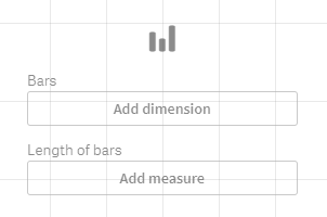
- When creating visualisations, Qlik have added more descriptions/explanations to assist users and improve data literacy.
Insight Advisor Improvements in Qlik Sense September 2020 Release
Since the Insights Advisor was first introduced into Qlik Sense June 2018, I’ve been a huge fan. So much so that I wrote it into the heart of our Analyser training course, and I promote it as the first approach to building visualisations in Qlik. In the latest release of Qlik Sense, more improvements have come to the Insights Advisor and it’s like comparing a modern smart phone against a Nokia 3210.
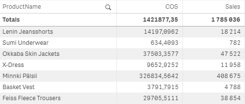
One small addition I noticed is the addition of banded rows in tables, so simple and so nice to see:
The really impressive stuff comes in the form of advanced analytics calculations. With the Qlik Sense September 2020 release, Qlik have introduced advanced analytics calculations on board the Qlik Associative Engine. The first function to become available is k-means clustering. Put simply, the aim is to segregate groups with similar traits and assign them into clusters. This is commonly used for customer segmentation and fraud detection, amongst other use-cases. These advanced calculations will be shown in the form of charts categorised as “analysis types”. Unfortunately however, the new cluster chart has not been made available in the technical preview so we will have to come back to this after the GA release.
We do have access to two of the other new analysis type charts:
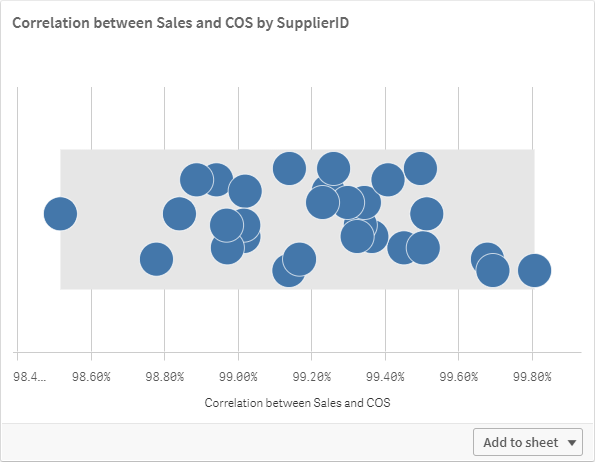
Correlation
To use this chart type, you need to select two numeric fields and 0,1 or 2 dimensions in the Insights Advisor. Below, you can clearly see the Analysis type specified and it has calculated the strength of the relationship between two numeric fields.

Add a dimension as well and it will show the strength of the correlation for each dimensional value:
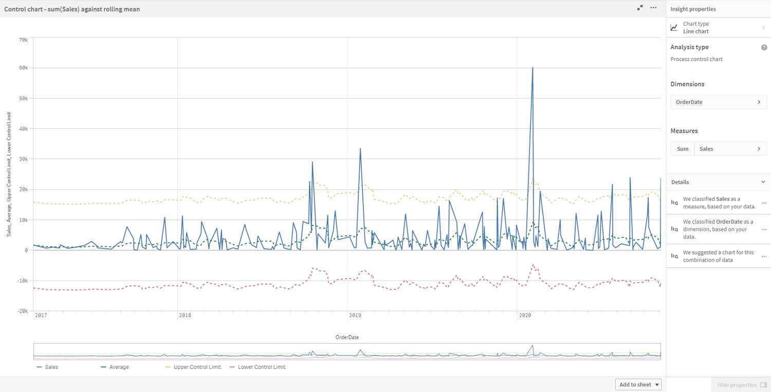
Process Control Chart
To return this chart type, you need a measure (or numeric field) and a date field. A process control chart shows the average, upper control limit and lower control limit in addition to your chosen measure:
In addition to these new analysis type charts, you have access to the pre-existing chart type: Overview, Contribution, Breakdown, Year-To-Date, Rank, Values, Trend, Comparison, Fact and Map distribution.
I think it can be said that these improvements are truly impressive – allowing users to achieve more by doing less, and that is key for making an intuitive product. This release as a whole, but particularly the Insight Advisor, has made large strides in helping with data literacy and reducing the time to actionable insights.
Master Measure Number Formatting
Probably the most exciting thing to come in Qlik Sense September 2020, though, is the ability to apply number formatting to master measures. Why this was not present from the beginning, only Qlik will know, but we can stop complaining and start going through all our master measures and set this valuable option – the amount of time and clicks this will save will be immeasurable! I mean it isn’t, but it will save at least four unnecessary clicks each time you add a master measure, it will ensure consistency across your Qlik sheets, improve maintenance efficiencies and you won’t be muttering to yourself “why can’t I set this in the master measure”.
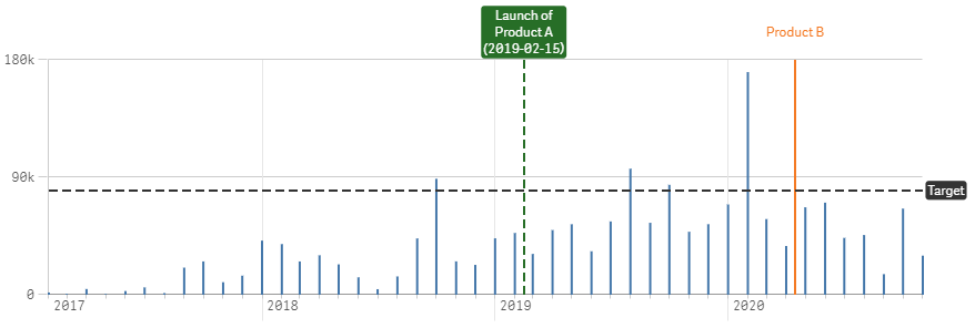
Vertical Reference Lines
In addition to the existing horizontal reference lines, Qlik developers can now add vertical reference lines, which are useful for highlighting key events in a line chart. The full features are noted below:
- Specify dimension value
- Specify text and or value
- Show condition
- Expression supported
- Discrete and continuous axis
- Dashed or solid
- Coloured background for labels
Animator Object
Interestingly, in the Qlik Sense September 2020 release there is a new Dashboard object being added to the Dashboard bundle – the animator object. The animator object is not strictly ‘new new’. It has been migrated across from the GeoAnalytics extension, formerly a layer of the Idevio map object. The animator object cycles through a field’s values, commonly a date/time dimension and highlights data movement from one data point to the next. This has become quite popular on social networks such as Twitter and LinkedIn.
The new animator object features:
- Auto selections
- Animate over dimension
- Aggregated or single select
- Loop
- Time based
- Custom sort
- Filter slider
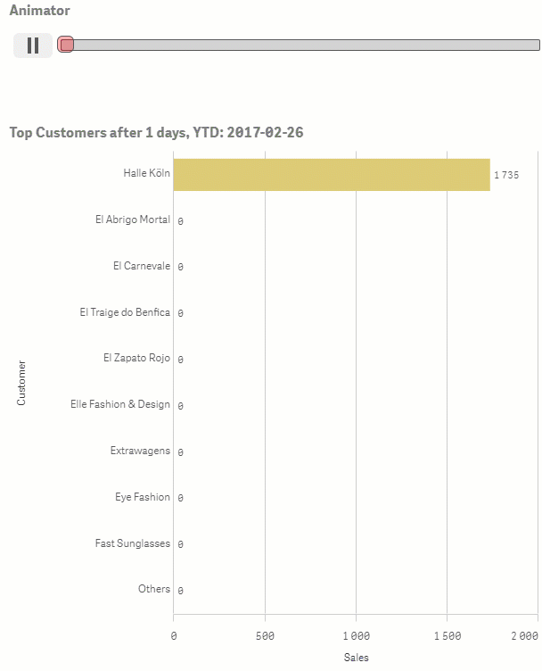
I don’t expect this to be widely adopted, as it is somewhat gimmicky, but it does make for an interesting demo nonetheless.
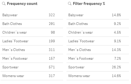
Filter Panel Frequency Count
Some QlikView gap feature closure has also managed to make it’s way into the latest release of Qlik Sense, in the form of frequency count in Filter panes:
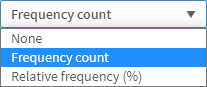
This gives new purpose to adding filter panes to your sheet. Up to now I collapsed or didn’t bother with filter panes on the sheet, instead opting to educate users to use the selection tool. However, this will be very useful for those that want extra insight into their data. Appearing under the Data tab, users can quickly enable frequency count or relative frequency for each field.
I wonder if we can expect to see this in the Selection tool as an option too, configurable via the field setting or master dimension?
Other Chart Improvements in Qlik Sense September 2020 Release
- Toggle borders in the container:
- Custom Sorting in Sankey.
- WMS layer opacity.
App distribution
App Distribution is now supported from Qlik Sense Enterprise on Windows multi-node deployment into a Qlik Sense Enterprise SaaS tenant. I will look to review this after the GA release.
QMC status page
Offering a better way to understand and monitor app distributions; e.g. Showing the user a link to their Multi-Cloud Setup Console. I will look to review this after the GA release.
Ask Insight Advisor
In Qlik’s SaaS offering we have a true game changer – Insight Advisor Chat. Effectively this is Qlik Insight Bot bundled, at no extra cost, into the SaaS offering. Not only that, it’s a much better version, effortless setup and a slicker interface – I configured this app in under a minute:
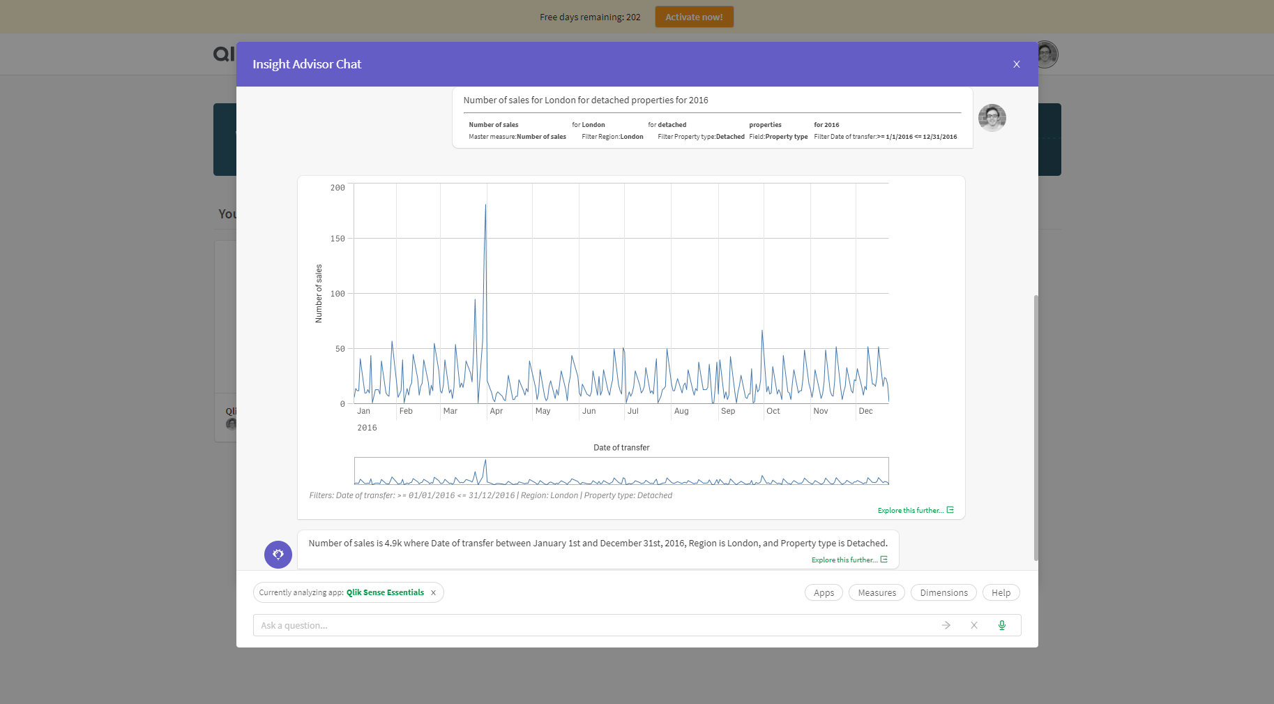
Here are some brief features/improvements:
- Ask questions from your data.
- Use natural language to analyse data.
- Returns Qlik Sense charts when appropriate.
- An app can be on-boarded with a click of a switch.
- Analyse data from any on-boarded app from the Hub.
- Define your own logical model for your apps with Business logic.
This is so simple to setup and easy to extract insights from data. One thing is for sure, I’ll be writing a blog post dedicated to this feature in the near future.
Qlik Sense September 2020 Release: Summary
Qlik are really starting to push the boundaries with the Insight Advisor, which continues to offer users an intuitive interface for analysing and creating visualisations. Qlik appear to be leading the way with augmented intelligence features and it’s clear we are only seeing the tip of the iceberg. In addition, with the improved user interface changes, Qlik Sense is becoming even more user-friendly and will improve data literacy across many organisations. But I have to be honest, the ability to format master measures has been on my wish list for far too long not to take the prize for ‘best feature of the release’.
Note: Any Ometis customer on our Proactive support offering can choose to use one of their three free upgrades.
If you’d like a free masterclass in accelerating insights through augmented analytics, sign up for the final stop in the UK of the Qlik Analytics Tour, which is hosted by Ometis, here.
Topic: Data analytics


Comments